-
I want to thank all the members that have upgraded your accounts. I truly appreciate your support of the site monetarily. Supporting the site keeps this site up and running as a lot of work daily goes on behind the scenes. Click to Support Signs101 ...
You are using an out of date browser. It may not display this or other websites correctly.
You should upgrade or use an alternative browser.
You should upgrade or use an alternative browser.
Font ID Please
- Thread starter Signs4Realtors
- Start date

Fred Weiss
Merchant Member
Edwardian Script Alt
SignosaurusRex
Active Member
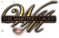
Looks to be Adobe Caslon for THE MARTINEZ GROUP
Signs4Realtors
New Member
Both of those fonts are great for the W and for THE MARTINEZ GROUP, but what is the M font in the WM logo? It is a slightly different font than Edwardian Script? Thanks in advance for your help!
Fred Weiss
Merchant Member
Both of those fonts are great for the W and for THE MARTINEZ GROUP, but what is the M font in the WM logo? It is a slightly different font than Edwardian Script? Thanks in advance for your help!
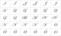
Both the M and the W are alternate characters in the font. Check the Glyphs page and you will see them.
https://www.myfonts.com/fonts/itc/edwardian-script/pro-regular/glyphs.html
Signs4Realtors
New Member
I can only see the upper case M and the lower case M. Question: What exactly do I type using the Edwardian Script font to get the M to display like in the sample? It isn't cap locks and M...do I need to type in special characters to alternate the M character?Both the M and the W are alternate characters in the font. Check the Glyphs page and you will see them.
https://www.myfonts.com/fonts/itc/edwardian-script/pro-regular/glyphs.html
Fred Weiss
Merchant Member
Fred Weiss said:Both the M and the W are alternate characters in the font. Check the Glyphs page and you will see them.
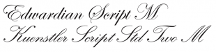
The "M" in the "WM" part of the BrokerLogo.jpeg image is definitely not in any version of ITC Edwardian Script. It's not one of the alternatives of the "pro" OpenType version. That particular "M" was indeed grabbed from a variant of Kunstler Script. The funny thing is there are multiple flavors of it from different foundries. For instance Linotype's Kunstler Script Std has a different looking "M". Kunstler Script Two has an "M" that is a match.
Fred Weiss
Merchant Member
The "M" in the "WM" part of the BrokerLogo.jpeg image is definitely not in any version of ITC Edwardian Script. It's not one of the alternatives of the "pro" OpenType version. That particular "M" was indeed grabbed from a variant of Kunstler Script. The funny thing is there are multiple flavors of it from different foundries. For instance Linotype's Kunstler Script Std has a different looking "M". Kunstler Script Two has an "M" that is a match.
It is glyph [HASHTAG]#469[/HASHTAG] from the ITC Edwardian Script font sold at MyFonts.com. Here's a link to the display page:
https://www.myfonts.com/fonts/itc/edwardian-script/pro-regular/glyphs.html?render=old
Details of the actual glyph are shown HERE.
I'm still not seeing that "M" in the BrokerLogo.jpeg file in the ITC Edwardian Script Pro glyph table. I've scanned through all 600+ glyphs on that page and only see two capital "M" characters. I attached a screen shot of that part of the table. I also attached a comparison of the "M" glyphs in the two typefaces. That "M" in the Kuenstler sample is not in the Edwardian Script typeface.
Attachments
Signs4Realtors
New Member
Fred Weiss
Merchant Member
I'm still not seeing that "M" in the BrokerLogo.jpeg file in the ITC Edwardian Script Pro glyph table. I've scanned through all 600+ glyphs on that page and only see two capital "M" characters. I attached a screen shot of that part of the table. I also attached a comparison of the "M" glyphs in the two typefaces. That "M" in the Kuenstler sample is not in the Edwardian Script typeface.
Sorry for the confusion. I have been basing my comments on the "M" in Martinez ... not the "M" in the broker's logo itself. I just noticed that they are different.