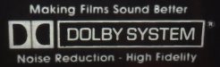
Most people are very familiar with variations of the Dolby logo. I attached a copy of the original "Dolby System" logo from the 1970's. I'm trying to figure out specifically what typeface was used for the lettering above and below the logo, "Making Films Sound Better" and "Noise Reduction • High Fidelity."
The image sample isn't the greatest in quality, but enough is there to really puzzle me. At first glance I thought it was ITC Avant Garde Gothic. But the "R" is wrong, the upper and lower case "S" is a little different, and the "B" is too wide compared to the sample image. Then I thought it could be Century Gothic, but the 'M" is all wrong and some of the other letter geometry is not right.
I'm not sure what else the typeface could be, but it's obviously something that was popular in 1970's advertising. I don't have one of my old Letraset font books from the late 70's or early 80's handy. I have a feeling the correct typeface would be in there.