GRAFIKWORX
New Member
Hey everyone,
I was in the Sign Business from the mid 80s to mid 90s,Mostly Hand Painted back then. It sure has changed since then. Anyway I have been doing Custom Boat and Motor Sports graphics for the past 12 years but its getting harder to find people that want to spend $25,000 on paint jobs these days. My ex wife is still in our old Sign business and doing pretty well for herself, (she mostly does vinyl Boat names).
I was thinking of venturing into to the general public to be in a more mainstream market again, offering Graphic design service, trucks, Logos and signs and what ever involves layout.
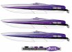
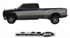
attached: are some renderings of what I do now.
Also attached: is my first try on a new Logo for myself to hit the streets with to offer my services.
Feel free to tell me what you think of the logo and the change of direction for my type of work.
Thanx Harold
I was in the Sign Business from the mid 80s to mid 90s,Mostly Hand Painted back then. It sure has changed since then. Anyway I have been doing Custom Boat and Motor Sports graphics for the past 12 years but its getting harder to find people that want to spend $25,000 on paint jobs these days. My ex wife is still in our old Sign business and doing pretty well for herself, (she mostly does vinyl Boat names).
I was thinking of venturing into to the general public to be in a more mainstream market again, offering Graphic design service, trucks, Logos and signs and what ever involves layout.
attached: are some renderings of what I do now.
Also attached: is my first try on a new Logo for myself to hit the streets with to offer my services.
Feel free to tell me what you think of the logo and the change of direction for my type of work.
Thanx Harold


")