-
I want to thank all the members that have upgraded your accounts. I truly appreciate your support of the site monetarily. Supporting the site keeps this site up and running as a lot of work daily goes on behind the scenes. Click to Support Signs101 ...
You are using an out of date browser. It may not display this or other websites correctly.
You should upgrade or use an alternative browser.
You should upgrade or use an alternative browser.
frontage calculation question...
- Thread starter imajenn
- Start date
Notarealsignguy
Arial - it's almost helvetica
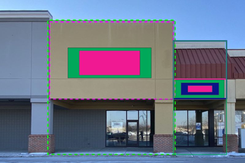
"building face to which it is attached"
Pink. It doesn't say total building face and is probably geared more towards the big boxes
Pink. It doesn't say total building face and is probably geared more towards the big boxes
Texas_Signmaker
Very Active Signmaker
The green box.
The pink box in what we in the industry refer to as the "sign band".
If they were referring to the sign band, those tenants on the right would have some very tiny signs.
The pink box in what we in the industry refer to as the "sign band".
If they were referring to the sign band, those tenants on the right would have some very tiny signs.
Notarealsignguy
Arial - it's almost helvetica
But that is probably about right if you include the roof thing? The left looks like the anchor grocery store with an attached liquor store which is the area in question? How would the 15% calculate for them? Total store and sub-store or each individual?
Notarealsignguy
Arial - it's almost helvetica
Haha, you're better off asking here, they won't even know their own rulesAnd there you have it.
You don't ask us, you ask the people who wrote the rules. Everyone's take is gonna be different.
probably true, but i would bet it never stopped them beforeHaha, you're better off asking here, they won't even know their own rules
Bradley Signs
Bradley Signs
Email all your goodies with one way on it, if that doesn't trip their trigger, send the other design.
Notarealsignguy
Arial - it's almost helvetica
Hey I like common core. It sure did suck to run through a page long math problem, screw up 1 digit and get the whole thing wrong.I'd cover the whole pink area and then show them my common core math worksheet that proves my 15% calculation.
visual800
Active Member
i would say referring to pink only the green part has nothing to do with signage. As far as 15% just throw a design on it no one follows that crap anymore, everyone is just happy to have tenants. Some idiot architect made up those rules and they only applied when the first tenants moved in lol
brdesign
New Member
Check with the permitting office. Some of the cities I deal with would go by the pink area and others would go by the green area. It's weird how multiple jurisdictions can have the same sign codes (because they just copy each other) but very different interpretations of those same codes.
John Miller
New Member
Design your sign using the green area. Propose the sign to zoning as if you're sure it's correct. If they approve, get it in writing. If not revert to the pink. Tell your client in advance you are trying to get them the biggest sign they can have. If your first proposal fails, it's the towns fault, At least you tried.
Notarealsignguy
Arial - it's almost helvetica
is it a municipal ordinance or part of the tenant rules for the plaza?
Notarealsignguy
Arial - it's almost helvetica
It has to be the pink area if the rule applies the same to all tenants. Here it is scaled to 15% with 3 areas with the slot next door

Notarealsignguy
Arial - it's almost helvetica
If you stretch the anchor out to what you would assume would be the size of it and use the green, it looks overbearing. Like you would see in an old run down complex and the look that cleaner places try to avoid. I had it laid out but Corel crashed at the end while exporting it. Anyways, that is my 2 cents
Gino
Premium Subscriber
Your illustration is most likely wrong. Those windows below your smaller sign are probably part of the door to the main area jutting out to the left. I don't see a door on that smaller side. It used to be, you still take the overall dimensions and fit it in the area the best way possible. Some people make out and others don't. Also, anchor stores will have an exception clause for their areas. So the rules are all gonna be willie nillie, just like out on the pylons.
