• I want to thank all the members that have upgraded your accounts. I truly appreciate your support of the site monetarily. Supporting the site keeps this site up and running as a lot of work daily goes on behind the scenes. Click to Support Signs101 ...

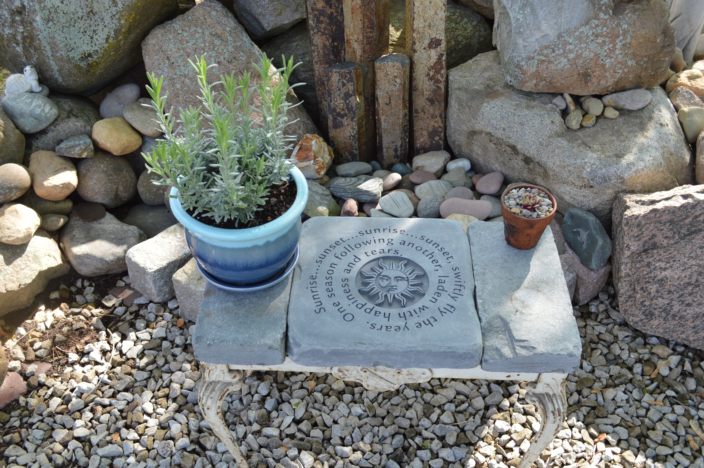
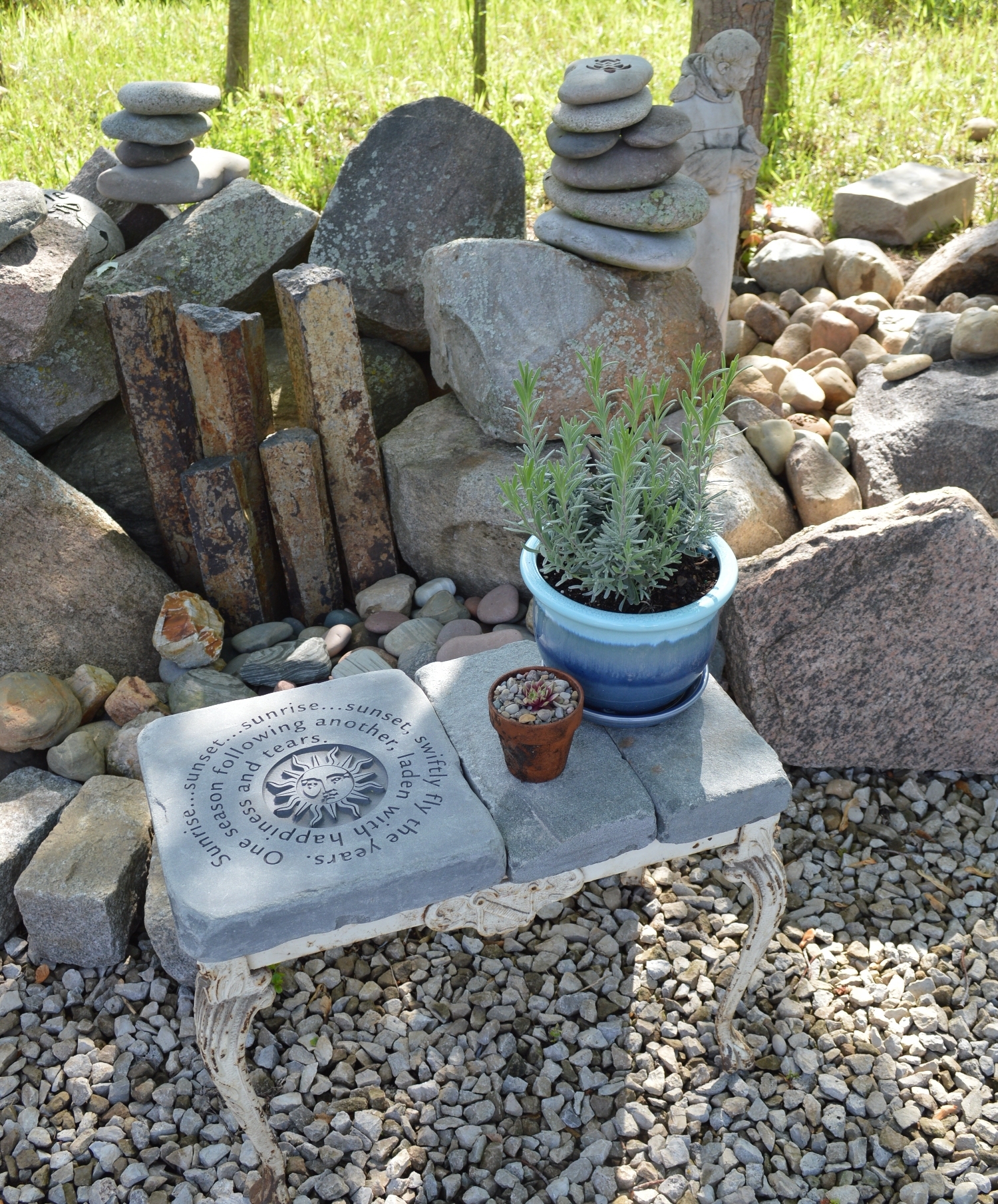
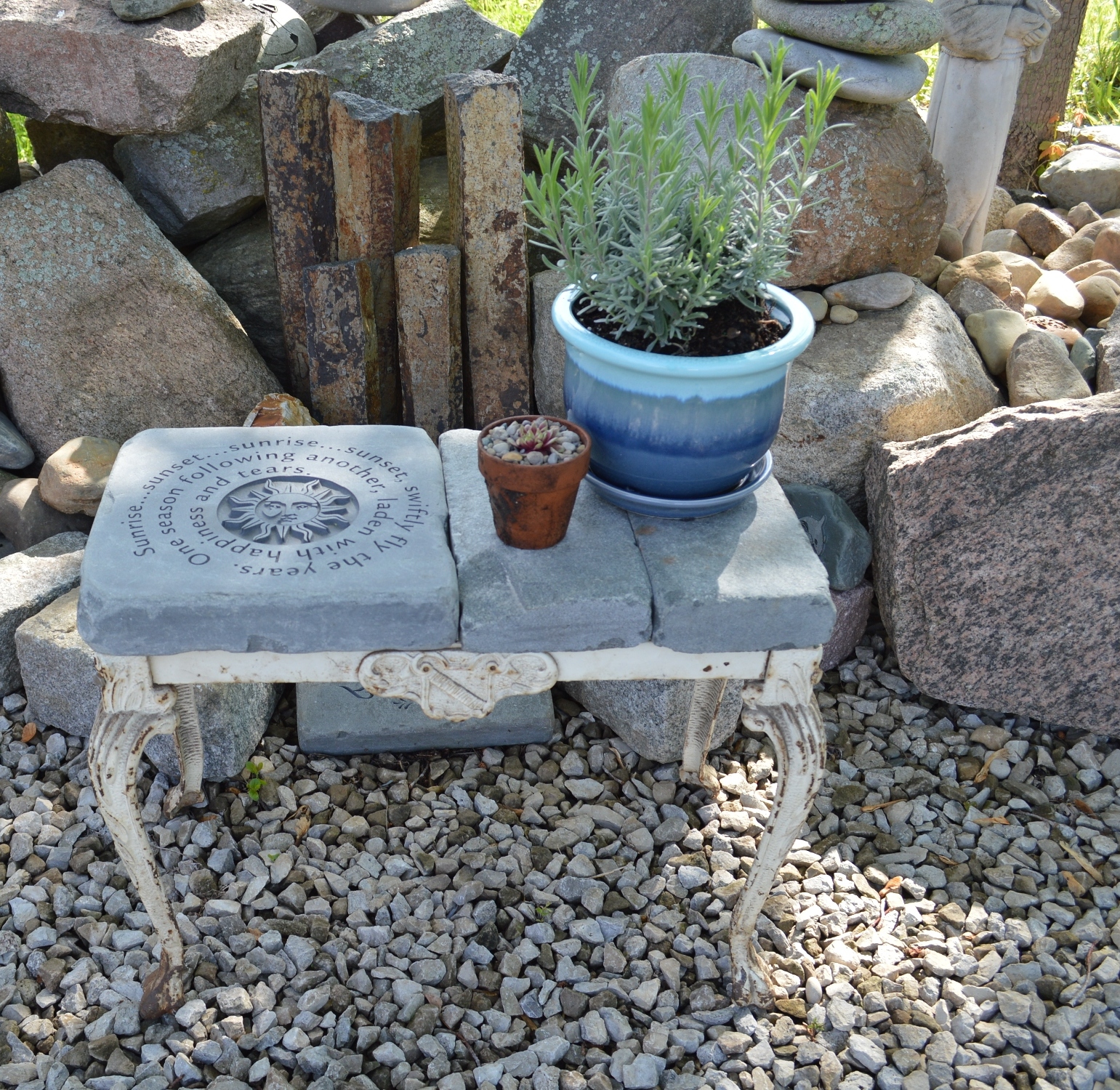
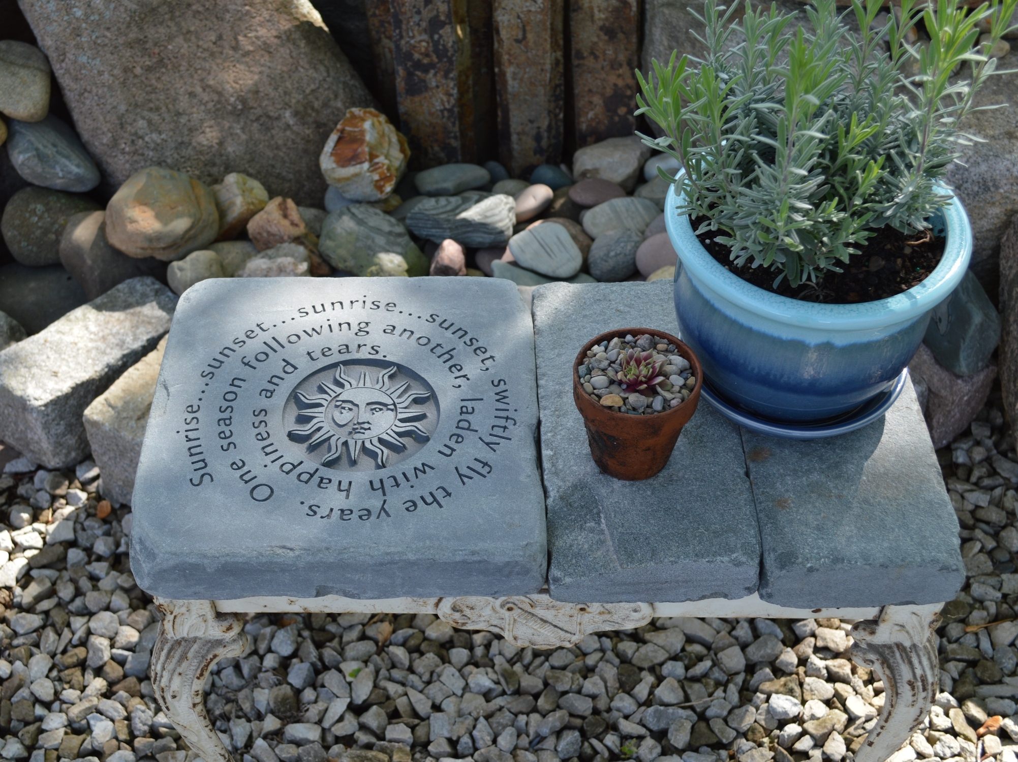
Garden Bench courtesy of Gerber Omega

James Burke

Being a grandpa is more fun than working
I know it's not a sign...but it was a lot more fun.

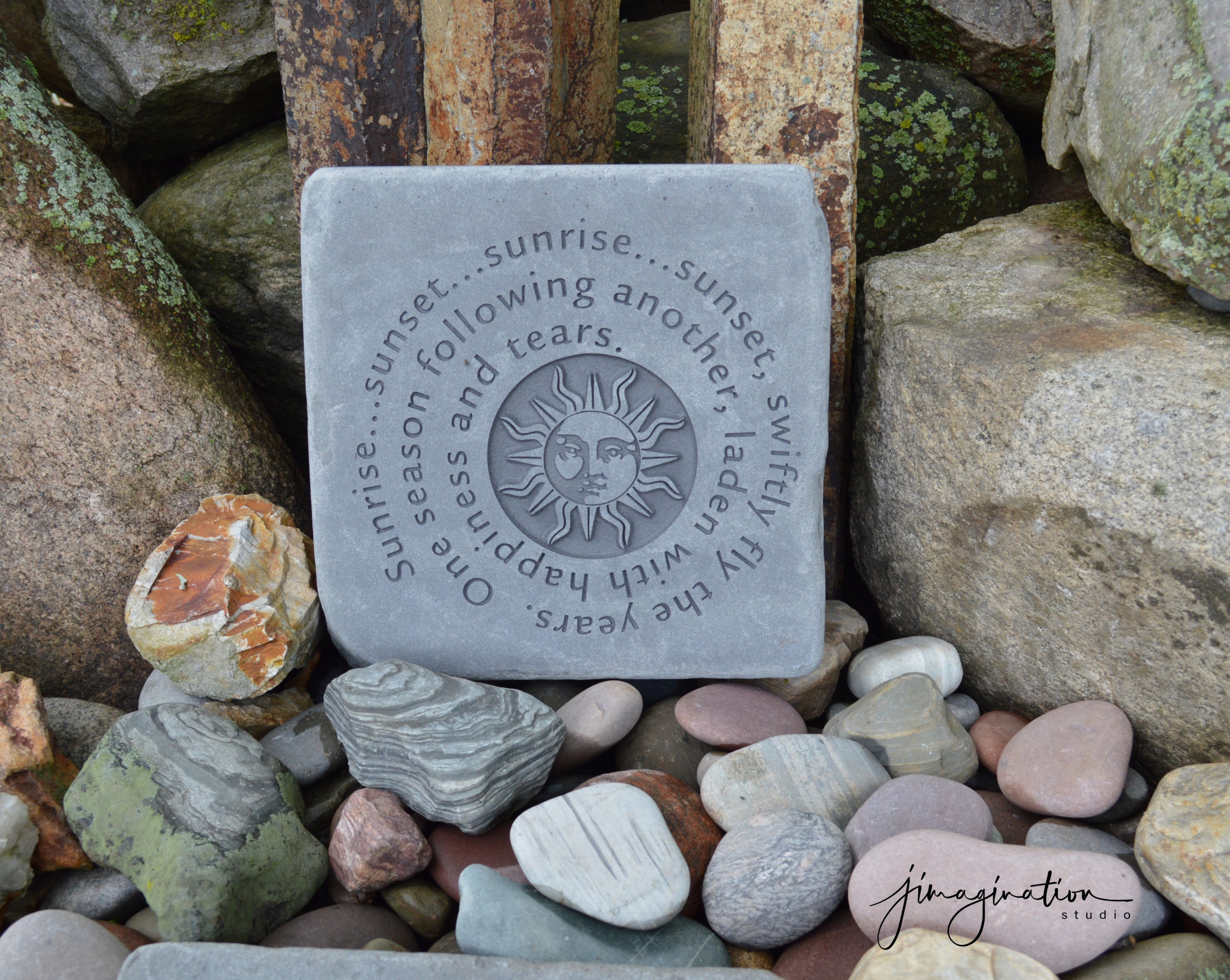
The artwork was composed in Gerber Omega and cut on the GS15+. Lettering and artwork are deep-cut sandblasted, with the circle around the sun approx. 1/4" deep.

The stone pieces are tumbled blue stone, and can be configured two different ways on the bench. The claw foot cast iron stand is an antique vanity bench I found on Facebook marketplace. After doing this project, I've found a new appreciation for the old junk people want to get rid of.

Bonus points if you can give the name of the film (hint: musical). And, if you do know which film it is, you're probably humming the tune.

JB
d.JPG


1(S).jpg


c.JPG


e.JPG


a.JPG
 
Last edited:

James Burke

Being a grandpa is more fun than working
Fiddler?
Very nice work. Make's me think I need to get into sandblasting, we did it a couple of decades ago but I've never seen it done in my time here. How long does something like this take to blast?

We have a winner! It's one of my favorite films of all time...with a lot of deep themes...especially for those of us as parents, watching the last fledgling leave the nest. But then the grand babies begin coming and starts the whole process over again..it never gets old.

The stone measures 12" x 12", and the blast time was aprox. 10 to 15 minutes. Bluestone is a fairly dense form of sandstone / limestone and it holds incredible detail.

JB
 
Last edited:

printhog

New Member
Love that!! Nice work.

Here's a fun 'barstool' fro a moose lodge.. 0.25" letters routed into cheap barstool... Omega for design and Sabre for routing.. Gerber seems to get better kerning than other apps.
BS Club2.jpg
 

Attachments

  • BS-Club-150x150.jpg
    BS-Club-150x150.jpg
    7.2 KB · Views: 346

Billct2

Active Member
Gerber spent a lot of time on kerning their fonts in the beginning and gave great tools for making adjustments. One of my earliest and continuous beefs with computerized sign making is the total lack of care for kerning, and spacing of all kinds. I prefer to my text in Gerber before importing to Corel for the other work.
 

James Burke

Being a grandpa is more fun than working
Gerber seems to get better kerning than other apps.

I couldn't agree more about Omega. The very fact that you can "severely" manipulate text (as in the spiral) and still have 100% full edit-ability of the text and the path is worth the price of the software.

I also use SignLab, and anytime you do anything funky or creative, it automatically converts to curves/objects...causing you to always need extra copies on the artboard anytime you want to make adjustments.

JB
 

printhog

New Member
I was told that Gerber's fonts are actually URW fonts licensed decades back. URW has the same kerning tables and extended characters in their current font offerings, but the apps that are out are limited in the other options that don't rely on the font, like the text on curves and other effects.. URW's old software SIGNUS was an amazing tool in the DOS days, did all that stuff perfectly and then some. But there 600 font collection was NOT windows compatible.. I miss it, it fostered a love for typography in all the staff who used it.
 

James Burke

Being a grandpa is more fun than working
I was told that Gerber's fonts are actually URW fonts licensed decades back. URW has the same kerning tables and extended characters in their current font offerings, but the apps that are out are limited in the other options that don't rely on the font, like the text on curves and other effects.. URW's old software SIGNUS was an amazing tool in the DOS days, did all that stuff perfectly and then some. But there 600 font collection was NOT windows compatible.. I miss it, it fostered a love for typography in all the staff who used it.

I have no complaints about the automatic kerning, but I think what's most amazing about Omega is the simple method for manual kerning. It's as simple as moving characters one direction or the other a very small amount at a time...until it looks good.

In the monument industry, there are always problems with optical illusions when you have two dates on a stone that don't appear to align due to the typeface or some design element in close proximity. "True center" (geometric center) and "Optical center" (visual center) are two totally different animals.

JB
 

James Burke

Being a grandpa is more fun than working
Facebook marketplace has been good this week. I just brought home another ornate antique cast iron vanity bench tonight with a special theme in mind. Stay tuned.

JB
 
Top