-
I want to thank all the members that have upgraded your accounts. I truly appreciate your support of the site monetarily. Supporting the site keeps this site up and running as a lot of work daily goes on behind the scenes. Click to Support Signs101 ...
You are using an out of date browser. It may not display this or other websites correctly.
You should upgrade or use an alternative browser.
You should upgrade or use an alternative browser.
Grade This Logo
- Thread starter Thwizzit
- Start date
MadGraphixINC
New Member
:ROFLMAO::ROFLMAO:HAHAHAHAHAHAHAHAHAHAHAHAHA!!!!!! Wonder who let that one slide? 

SignosaurusRex
Active Member
I heard a snippet on a talk radio/news program today about it and the U's comments in defense.
I think the grade speaks for itself.....at best. On second thought, it should be F-
I think the grade speaks for itself.....at best. On second thought, it should be F-
SignManiac
New Member
+ or - five
"Deposit Please"
New Member
F-
GypsyGraphics
New Member
This is interesting...
Officials said the school tested the concept on 921 high school students, and more than 75 percent said the logo was either a little or very attention-grabbing. School spokeswoman Lisa Lacher said since unveiling the campaign this summer, the school has seen an increase in inquiries and campus visits.
So their target market was who..... the D+ high school student? Who else would that logo appeal to? And of the increase in inquires, i'd be curious to know the grade point average of those students.
Who knows, maybe they hit their target with a logo that appears to say...
Nirvana for the nearly failing student, who otherwise might not be college bound.
SignManiac
New Member
A++
CheapVehicleWrap
New Member
May as well target the masses.

somethingontheside
New Member
The logo and grade are pretty much interchangeable. I hope they don't have a graphics school. Then, as my son put it, "It would be an EPIC FAILURE".
Drake changes admissions website, removes 'D+' logo
Updated 11:51 am
BY SHEENA DOOLEY
September 9, 2010
Drake University has pulled the D+ logo that is part of its new recruitment campaign from the school’s Web site and replaced it with “Drake” followed by a plus sign.
The school’s new campaign “The Drake Advantage” has drawn a lot of attention in the past week, as many students, staff and alumni have criticized it, saying it hurts the school’s image. Drake officials say the campaign was meant to grab people’s attention, specifically that of college bound high school students, and set the school apart from others.
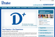
Previously, the admissions page of Drake’s Web site featured the large D+ logo and the following statement: “When we talk about D+, that’s what we mean. Every moment at Drake is one that has the power to educate, to transform, to open minds and to unleash potential – to introduce who you are, to who you hope to become.”
Both have been replaced. It now has a slideshow that pairs phrases such as “Your pride + the Bulldog spirit” and “Your potential + academic rigor” followed by “Drake” and the plus sign, which appears in a separate slide.
However, the D+ logo hasn’t completely disappeared. The Web site provides a link to a brochure that is sent to prospective students. A big D+ covers most of the front.
Tom Delahunt, Drake’s vice president for admissions and student financial planning, said last week the school typically uses its recruitment campaigns for two to three years. Drake officials will have to monitor the response to the new campaign, but the school had planned that it would be no different in terms of its lifespan, he said.
Updated 11:51 am
BY SHEENA DOOLEY
September 9, 2010
Drake University has pulled the D+ logo that is part of its new recruitment campaign from the school’s Web site and replaced it with “Drake” followed by a plus sign.
The school’s new campaign “The Drake Advantage” has drawn a lot of attention in the past week, as many students, staff and alumni have criticized it, saying it hurts the school’s image. Drake officials say the campaign was meant to grab people’s attention, specifically that of college bound high school students, and set the school apart from others.
Previously, the admissions page of Drake’s Web site featured the large D+ logo and the following statement: “When we talk about D+, that’s what we mean. Every moment at Drake is one that has the power to educate, to transform, to open minds and to unleash potential – to introduce who you are, to who you hope to become.”
Both have been replaced. It now has a slideshow that pairs phrases such as “Your pride + the Bulldog spirit” and “Your potential + academic rigor” followed by “Drake” and the plus sign, which appears in a separate slide.
However, the D+ logo hasn’t completely disappeared. The Web site provides a link to a brochure that is sent to prospective students. A big D+ covers most of the front.
Tom Delahunt, Drake’s vice president for admissions and student financial planning, said last week the school typically uses its recruitment campaigns for two to three years. Drake officials will have to monitor the response to the new campaign, but the school had planned that it would be no different in terms of its lifespan, he said.
QualitySigns
New Member
Sigh...