-
I want to thank all the members that have upgraded your accounts. I truly appreciate your support of the site monetarily. Supporting the site keeps this site up and running as a lot of work daily goes on behind the scenes. Click to Support Signs101 ...
You are using an out of date browser. It may not display this or other websites correctly.
You should upgrade or use an alternative browser.
You should upgrade or use an alternative browser.
Green tint in print
- Thread starter ptmaxx
- Start date
Jester1167
Premium Subscriber
Then it looks perfect in the shop and you pull it outside and it looks green in the sun and even worse on a cloudy day... Color matching/correction, isn't it fun?
derekw13029
New Member
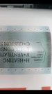
So this has only happen on this print. For some reason it has a green tint. All other prints are perfect. Roland sc540 soljet2 ex. Using colorip. Has anyone seen this
I do not use any of your particular equipment, but I have this problem from time to time when printing black and whites. If a file is in the CMYK color mode, when I import the file into my RIP (FlexiPrint HP), it will have a very noticeable green tint.
However, if I switch the color mode of the image to RBG, then import the file, the RIP interprets it to a more neutral tone.
This may or may not be your problem, but it is a suggestion you might try.
Depending on how your printer is calibrated, CMYK blacks can appear to any from "warm" to "cool" including baby poo green. A suggested "rich black" will solve most of those problems.
Depending on how your printer is calibrated, CMYK blacks can appear to any from "warm" to "cool" including baby poo green. A suggested "rich black" will solve most of those problems.
Can you explain how i would go about doing this
so this has only happen on this print. For some reason it has a green tint. All other prints are perfect. Roland sc540 soljet2 ex. Using colorip. Has anyone seen this
only happens when printing grey
Ultimate13
New Member
Rich Black is simply adding percentages of CMY into the black. We use 60% 40% 40% 100%. Greys are always difficult as it has been said.
Rich Black is simply adding percentages of CMY into the black. We use 60% 40% 40% 100%. Greys are always difficult as it has been said.
Do you set that in the Halftone Properties?
Ultimate13
New Member
Do you set that in the Halftone Properties?
No you set that in the CMYK values for the black color you are using instead of just 100% black. I don't think this will solely fix your problem tho. I am sure there is someone better at color correction than me that can chime in here.
No you set that in the CMYK values for the black color you are using instead of just 100% black. I don't think this will solely fix your problem tho. I am sure there is someone better at color correction than me that can chime in here.
Now how would i go about that in colorip?
Now how would i go about that in colorip?
With the best matching profile i have for the material im getting a slight magenta and green tint mixed. Just enough to pick up with the eye
Ultimate13
New Member
With the best matching profile i have for the material im getting a slight magenta and green tint mixed. Just enough to pick up with the eye
That's the trouble with greys you either get a hint of green or a hint of pink/red, they are tough to get to look just grey unless there is a setting to print your grey using only black. Then the rich black idea doesn't apply.
I set up the CMYK values when I build the file in Illustrator. I also work in VersaWorks so I really don't know Colorip.
Sorry I am not of more help.
Jester1167
Premium Subscriber
Unless you have thousands to spend on custom profiles just to make it better, learn to design away from large areas of grey in the future. There are so many variables, RIP, Ink, Linearization and profiles, material, laminate, and lighting conditions (sunny, cloudy, morning, evening, inside, and out). Greys were so frustrating that in the past I resorted to using halftone dot patterns to create greys on a few projects. I don't have a printer at this time but I have heard that the HP latex and Rolands with light grey do a lot better job of printing greys and halftones.
This is an age old problem and your not alone. I have been here since 2008 and greys are a problem for most, and grey gradients are a nightmare. If color is critical make sure you print a proof on the actual material, laminate it, and have the customer view it in the conditions it will be viewed in - vehicle wrap, exterior sign; outside in the sun, interior sign; inside under florescent lighting.
Laminating your proof is important because of the varying amounts of UV inhibitors in different laminates will make a difference in the color shift.