-
I want to thank all the members that have upgraded your accounts. I truly appreciate your support of the site monetarily. Supporting the site keeps this site up and running as a lot of work daily goes on behind the scenes. Click to Support Signs101 ...
You are using an out of date browser. It may not display this or other websites correctly.
You should upgrade or use an alternative browser.
You should upgrade or use an alternative browser.
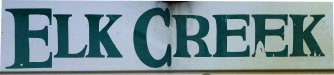
Hand painted lettering WTF
- Thread starter stoliker
- Start date
shoresigns
New Member
Might be loosely based on a font, but this looks like a rookie freehand job. Judging by how butt ugly it is, it's unlikely they used a pounce pattern of an actual font, if that's what you were thinking.
This is hand painted but I am sure its a font. Anyone know it?
Thanks!
Sort of like Perpetuta Regular font.
Attachments

93Works
New Member
I modified a font called Cambria and managed to come up with this. I didn't match the C's top and bottom outer serifs on the photo since it seems to be a different style compared to the rest of the letters, the "R" doesn't seem to be the same style either but I did match that one. I hope it helps!
Attachments

signbrad
New Member
These letters were hand drawn and then painted. This is the way most lettering was done before computers, though this job does look amateurish and was probably produced by a beginner.
Drawing letters by hand, and from memory, was a skill that every apprentice letterer learned. A roman letter like this example was usually not based on a typestyle and the word 'font' was unknown in sign shops before computers. The letter styles used by sign painters, called alphabets in the lettering trade, were constructed to be highly readable, especially from a distance. Sign painter alphabets did not slavishly imitate printer's typestyles.as a rule unless it was at the request of an insistent architect or client. Many of the printer's versions of roman letters, such as Times Roman, for example, with its hairline strokes, would have been considered unsuitable for most sign work.
Although extensively used today on computer generated sign work, letter styles like Times are inherently weak and lack visual impact. A sign lettered in all Times Roman has an anemic look. It's too white. Roman letters produced by journeymen sign painters were typically more robust, with thicker thin strokes and serifs. This was not always the case, but it usually was, at least as I remember it. And a good sign painter could modify a roman letter to fit the situation, adjusting stroke and contrast, height, width, and so on, as needed, without yielding the awkward look of a computer font that has been stretched or compressed artificially.
Times Roman looks fine at the small sizes common to print. But then that's what it was designed specifically for—newsprint held at arm's length.
Brad
Gino
Premium Subscriber
In addition to what Brad has said, I don't think that sign was up all that long. I too, think the letters were traced and then filled in by brush as certain letters still have the same short serifs and characteristics, other than the 'C'. If this had been a mask, you would not see the wavey straight edges, so an unsteady hand seems to be the culprit. Also, the lack of fading/seeing any brush strokes at all, is odd. However, there are patches of peeling lettering paint, which also indicated a not-so-good prep job. So the lack of brush strokes, but peeling letters, tends to make it less than 10 years, if not even less. Also, being a novice painter, most people who hand-painted had the old secret/crutch of using tape to keep edges straight. Obviously, this was not utilized.
Can't tell for certain from the picture, but if I had to venture a guess expanding on the observation of Gino an others it looks like it was done by hand by an amateur, but I'm thinking it WAS done using a mask since there re no brush stroke fades and those lines & corners look too crisp to match the ineptness of the lettering. I' guessing they drew/traced the lettering onto the mask then cut it out by hand with an exacto knife and then painted. That or the person who made it is really good at painting really bad signs...
signbrad
New Member
lines & corners look too crisp to match the ineptness of the lettering.
Good observation. The square serifs do look a little too clean to have been produced by a beginner's brush.