Gino
Premium Subscriber
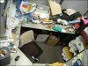
Before you get started on the layout/design end of things...... is there a reason why or how you come up with that name ??
That name would make me chuckle.... then toss that card into the round filing cabinet before considering it for any kind of services.... not because of fonts or colors at this point.... just the name alone.
That name would make me chuckle.... then toss that card into the round filing cabinet before considering it for any kind of services.... not because of fonts or colors at this point.... just the name alone.
 :Big Laugh
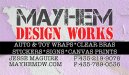
")
