-
I want to thank all the members that have upgraded your accounts. I truly appreciate your support of the site monetarily. Supporting the site keeps this site up and running as a lot of work daily goes on behind the scenes. Click to Support Signs101 ...
You are using an out of date browser. It may not display this or other websites correctly.
You should upgrade or use an alternative browser.
You should upgrade or use an alternative browser.
Here's a tough font I.D.
- Thread starter threeputt
- Start date

J Hill Designs
New Member
breath = skia
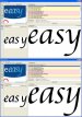
easy = cataneo
easy = cataneo
oldgoatroper
Roper of Goats. Old ones.
Breathe -- Skia Regular
oldgoatroper
Roper of Goats. Old ones.
easy -- Apple Chancery not Cataneo
Both are Mac-OS fonts
Both are Mac-OS fonts
J Hill Designs
New Member
oldgoatroper
Roper of Goats. Old ones.
Sample is not good enough to determine if the "roundness" is simply due to pixelation
"s" and "y" are closer match to Apple Chancery.
"s" and "y" are closer match to Apple Chancery.
J Hill Designs
New Member
you can fully tell that the s is not apple chancery
edit: and the tail of the y
edit: and the tail of the y
oldgoatroper
Roper of Goats. Old ones.
For all four letters, AC is a better match. Especially the 'a'
Now what I mean by that is that, because the sample is very poor quality, we can't go on "details" like the appearance of roundness at the terminals -- which can be entirely the result of pixelation.
We must go by overall letter shape. The Cataneo 'a's overall shape has strokes that are straighter and change direction more extremely. The AC 'a' overlaid on the sample would fit perfect. Same with the 'y'. The 's' is close in both cases, but the AC 's' is just a little more rounder, like the sample.
I don't have the font, since I don't use a Mac, but it also stands to reason that since the other font has already been identified as a Mac-OS font, then chances are really, really good, this is AC, also a Mac-OS font.
J Hill Designs
New Member
looking at it a 6th time, I believe you are correct 