-
I want to thank all the members that have upgraded your accounts. I truly appreciate your support of the site monetarily. Supporting the site keeps this site up and running as a lot of work daily goes on behind the scenes. Click to Support Signs101 ...
You are using an out of date browser. It may not display this or other websites correctly.
You should upgrade or use an alternative browser.
You should upgrade or use an alternative browser.
How do you calculate warp for rear windscreen print?
- Thread starter Roto
- Start date

James Burke
Being a grandpa is more fun than working
Accurately align a piece of 12 inch wide pounce paper across the entire width of the window, a few inches up from the bottom. Tape all four corners. You should see a "smile" along the bottom side of the paper's edge. Measure the vertical distance in between the "bottom" of the smile at the center of the window, and either far corner of the paper. This is the approximate amount of warp (in the opposite direction) you'll need to apply. (Your print will have a "frown")
JB
JB
Accurately align a piece of 12 inch wide pounce paper across the entire width of the window, a few inches up from the bottom. Tape all four corners. You should see a "smile" along the bottom side of the paper's edge. Measure the vertical distance in between the "bottom" of the smile at the center of the window, and either far corner of the paper. This is the approximate amount of warp (in the opposite direction) you'll need to apply. (Your print will have a "frown")
JB
Isn't it the opposite? On the window, the paper will be higher at the middle and lower towards the edges. That's a "frown". The print will have the opposite - it'll be lower in the middle - the "smile". I know I live on the underside of the Earth, hanging upside down, but still...
Yes most definitely a 'smilie' curve (negative horizontal arc in AI). Rear windows used to be very costly in reprints where they either naturally curved too much, where there wasn't enough bleed to account for the compound curvature, or the total height wasn't enough to cover the peak of the top edges to dip at the bottom centre.
Adding masses of bleed just makes positioning accurately difficult and wastes bulk dollars, so I developed a system to get it right every time. I'll post an example tomorrow when I've got access to my work files.
Adding masses of bleed just makes positioning accurately difficult and wastes bulk dollars, so I developed a system to get it right every time. I'll post an example tomorrow when I've got access to my work files.
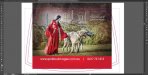
So I forgot for a few days. Here's an example of the problem. Goleby's Parts isn't one of my jobs, I saw it on Facebook and shook my head at how any self-respecting signwriter could let this go out (besides just looking stupid, the ".au" of the web address has been cut off, as has part of the text at the top and lower left).
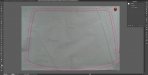
Here's an explanation of my method, probably nothing revolutionary but I can't recall any redos since we started doing it this way. It takes a little longer up front but gives a much better finish and less reprints.
1. When the customer brings in the vehicle (either the week before fitting, or on the day if you've got a Latex printed) tape some backing paper over the rear end and trace the window shape with a thick pen (also mark the position of wipers and plugs if present). Hang it up on a wall and take a nice square photo, zoomed in from a distance (to minimise camera barrel distortion).
2. Scale this from a known measurement and trace the shape. Offset the path 20-40mm for bleed area, and set both as guides.
3. Group and arc the artwork to approx match the curve of the top of the window. It takes a bit of experience to know what's right, and it depends if the top of the window appears as "straight" when viewing the car from behind. Usually the bottom of the window obviously appears as curved, so it'll look silly if you match this arc. It takes a bit of switching back and forward from the distorted and undistorted image to get all the image/text/colour elements positioned correctly. In these samples the arcs are negative 10-11% (not my choice in artwork by the way )
)
4. The customer won't know you've arced the print, it just looks right. It's better to under- rather than over-compensate the arc, your eyes will adjust somewhat for the compound curve but if you go too far it'll look odd.
I can't figure how to embed images in-line, I'm sure you can figure out which step each belongs to")
Here's an explanation of my method, probably nothing revolutionary but I can't recall any redos since we started doing it this way. It takes a little longer up front but gives a much better finish and less reprints.
1. When the customer brings in the vehicle (either the week before fitting, or on the day if you've got a Latex printed) tape some backing paper over the rear end and trace the window shape with a thick pen (also mark the position of wipers and plugs if present). Hang it up on a wall and take a nice square photo, zoomed in from a distance (to minimise camera barrel distortion).
2. Scale this from a known measurement and trace the shape. Offset the path 20-40mm for bleed area, and set both as guides.
3. Group and arc the artwork to approx match the curve of the top of the window. It takes a bit of experience to know what's right, and it depends if the top of the window appears as "straight" when viewing the car from behind. Usually the bottom of the window obviously appears as curved, so it'll look silly if you match this arc. It takes a bit of switching back and forward from the distorted and undistorted image to get all the image/text/colour elements positioned correctly. In these samples the arcs are negative 10-11% (not my choice in artwork by the way
)4. The customer won't know you've arced the print, it just looks right. It's better to under- rather than over-compensate the arc, your eyes will adjust somewhat for the compound curve but if you go too far it'll look odd.
I can't figure how to embed images in-line, I'm sure you can figure out which step each belongs to
Attachments


James Burke
Being a grandpa is more fun than working
Isn't it the opposite? On the window, the paper will be higher at the middle and lower towards the edges. That's a "frown". The print will have the opposite - it'll be lower in the middle - the "smile". I know I live on the underside of the Earth, hanging upside down, but still...
Ooops...sorry for the gaff. We do a lot of etched glass that involves stenciling compound curves and conical surfaces...I had my processes backward.
JB
So I forgot for a few days. Here's an example of the problem. Goleby's Parts isn't one of my jobs, I saw it on Facebook and shook my head at how any self-respecting signwriter could let this go out (besides just looking stupid, the ".au" of the web address has been cut off, as has part of the text at the top and lower left).
Here's an explanation of my method, probably nothing revolutionary but I can't recall any redos since we started doing it this way. It takes a little longer up front but gives a much better finish and less reprints.
1. When the customer brings in the vehicle (either the week before fitting, or on the day if you've got a Latex printed) tape some backing paper over the rear end and trace the window shape with a thick pen (also mark the position of wipers and plugs if present). Hang it up on a wall and take a nice square photo, zoomed in from a distance (to minimise camera barrel distortion).
2. Scale this from a known measurement and trace the shape. Offset the path 20-40mm for bleed area, and set both as guides.
3. Group and arc the artwork to approx match the curve of the top of the window. It takes a bit of experience to know what's right, and it depends if the top of the window appears as "straight" when viewing the car from behind. Usually the bottom of the window obviously appears as curved, so it'll look silly if you match this arc. It takes a bit of switching back and forward from the distorted and undistorted image to get all the image/text/colour elements positioned correctly. In these samples the arcs are negative 10-11% (not my choice in artwork by the way
4. The customer won't know you've arced the print, it just looks right. It's better to under- rather than over-compensate the arc, your eyes will adjust somewhat for the compound curve but if you go too far it'll look odd.
I can't figure how to embed images in-line, I'm sure you can figure out which step each belongs to
Gun post. All of that is pretty bang-on.
The only thing I'll add is that you can actually measure the swoop. You have to do it on the vehicle though, not the tracing. Using a rigid tape measure or a straight-edge that can curve on one dimension, put the zero point on roughly the top left corner, and bring your edge over so that it touches the corresponding spot on the top right. You'll notice that 99% of the time the top edge of the window swoops below the straight edge. At the centre, measure the gap between straight edge and window edge (normally anywhere from 20mm to 70mm). Do the same with the bottom -it'll probably be more (40mm to 120mm).
if you're lucky enough to have a program that can warp your graphic with a different arc at the top to the bottom, bonus (just use the measurements from above). If not, just average the two measurement (eg, 30mm at top, 50mm at bottom, so go with 40mm). Obviously you'll need to make sure no filters or effects get mangled by the arc, and it won't work on images in most programs. So swooping text that lines up with a nice horizon shot ain't gonna happen unless you can warp the image in Photoshop.
PS, when I see a rear window that has text cut off it just screams of a design agency. "Send me the width and height and we'll design it".
My question is why would you want to? and if you are going to calibrate the warp what are you going to do about the slant?
Im not being snarky but everything we have installed on a concave (if you will) surface, just let it be what its going to be
Because I come from a world of designing in 2D and I'll be damned if some 3D surface is going to dictate to me how my design will look
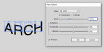
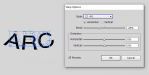
What do you mean by slant though? If done right, there will be no slant. It will appear skewed on the print when it's lying flat, but not when it's on the window. You just have to make sure you distort it using an ARCH, where the image is only distorted on one plane. As opposed to an ARC, where it tries to wrap the design in to a circular shape (I think I used the wrong term above):
Attachments
For the exact reason illustrated above. I'm proud to give my clients the best result possible; the less that others take the time to do it right, the more mine will stand out.
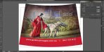
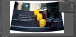
I warp it using an ARC personally. The way the compound curvature distorts print I've found that it results in the most natural appearance. I was a little concerned about warping a full image like that Spirit & Soul one above that the customer requested, but on the car it looked absolutely perfect.
Here's 2 examples from Google of no-correction and over-correction.
Attachments


For the exact reason illustrated above. I'm proud to give my clients the best result possible; the less that others take the time to do it right, the more mine will stand out.
I warp it using an ARC personally. The way the compound curvature distorts print I've found that it results in the most natural appearance. I was a little concerned about warping a full image like that Spirit & Soul one above that the customer requested, but on the car it looked absolutely perfect.
Here's 2 examples from Google of no-correction and over-correction.
Each to their own. If it works, it works!
So I forgot for a few days. Here's an example of the problem. Goleby's Parts isn't one of my jobs, I saw it on Facebook and shook my head at how any self-respecting signwriter could let this go out (besides just looking stupid, the ".au" of the web address has been cut off, as has part of the text at the top and lower left).
Here's an explanation of my method, probably nothing revolutionary but I can't recall any redos since we started doing it this way. It takes a little longer up front but gives a much better finish and less reprints.
1. When the customer brings in the vehicle (either the week before fitting, or on the day if you've got a Latex printed) tape some backing paper over the rear end and trace the window shape with a thick pen (also mark the position of wipers and plugs if present). Hang it up on a wall and take a nice square photo, zoomed in from a distance (to minimise camera barrel distortion).
2. Scale this from a known measurement and trace the shape. Offset the path 20-40mm for bleed area, and set both as guides.
3. Group and arc the artwork to approx match the curve of the top of the window. It takes a bit of experience to know what's right, and it depends if the top of the window appears as "straight" when viewing the car from behind. Usually the bottom of the window obviously appears as curved, so it'll look silly if you match this arc. It takes a bit of switching back and forward from the distorted and undistorted image to get all the image/text/colour elements positioned correctly. In these samples the arcs are negative 10-11% (not my choice in artwork by the way
4. The customer won't know you've arced the print, it just looks right. It's better to under- rather than over-compensate the arc, your eyes will adjust somewhat for the compound curve but if you go too far it'll look odd.
I can't figure how to embed images in-line, I'm sure you can figure out which step each belongs to
This, Sir, is magic.