-
I want to thank all the members that have upgraded your accounts. I truly appreciate your support of the site monetarily. Supporting the site keeps this site up and running as a lot of work daily goes on behind the scenes. Click to Support Signs101 ...
You are using an out of date browser. It may not display this or other websites correctly.
You should upgrade or use an alternative browser.
You should upgrade or use an alternative browser.
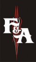
How's this Look
- Thread starter langecustomgraphics
- Start date

artbot
New Member
looking very cool... the only thing that jumps out at me is the spacing. maybe if the "and" was straight across you could tie the negative space in the F and A? you got the top and bottom of the F and A long and straight. i think the "and" should keep that motif. ...classic antique motor company meets hot rod. right now it's a bit too much hot rod.
TheSellOut
New Member
"F & A" man...I love it!
langecustomgraphics
New Member
Thanks I will try that. But is there really ever too much hot rod?
Signworks of Algoma
New Member
Love it! I love old school pinstriping! Most excellent!
Dave Drane
New Member
This is a something I have been working on for a moto racing team. I put team and racing in there, but it looked too busy. what do you guys think? Thanks for your opinion.
I don't think it looks racy enough for the end user... Nice but not really suitable


Jillbeans
New Member
I don't think it's suitable either, too tearoom looking.
If you are going to use it, tighten it up and tone down the white parts in the pinstriping cliparts to grey. They should just be accents.
I don't think that font has an actual ampersand, which could help it to look more concise.
Love....Jill
If you are going to use it, tighten it up and tone down the white parts in the pinstriping cliparts to grey. They should just be accents.
I don't think that font has an actual ampersand, which could help it to look more concise.
Love....Jill
Attachments

Last edited:
Gino
Premium Subscriber
I like it, but I would advise to make the flared ‘F’ not as you have it. To me it looks odd. The ’A’ is fine. I’d also make ‘and’ smaller, thus closing up the gap somewhat. People’s subliminal will automatically put the ‘and’ in there somehow……. 
I really like the name !! That was a saying I grew up using and still use to this day…… :Oops:
langecustomgraphics
New Member


Sign Up Graphics
New Member
Sign Up Graphics
Looks good!!!
Looks good!!!
mountainmang
New Member
#2 rocks
GypsyGraphics
New Member
I like this very much. Just a thought though, on versions 2 or 3...what if you modified the arm of the "F" to wrap around the "&."
this is just a quickie mod, you probably want to adjusts the spacing some.

Or maybe even modify both the arm of the "F" and the crossbar of the "A" to a custom shape around the "&"
this is just a quickie mod, you probably want to adjusts the spacing some.
Or maybe even modify both the arm of the "F" and the crossbar of the "A" to a custom shape around the "&"