• I want to thank all the members that have upgraded your accounts. I truly appreciate your support of the site monetarily. Supporting the site keeps this site up and running as a lot of work daily goes on behind the scenes. Click to Support Signs101 ...

i need some help with a logo

heyskull

New Member
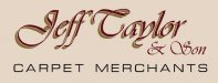
I have a customer with a pickup truck from the 60s/70s and we are trying to make his logo look kind of traditional signwritten.
Can anyone help as I am really struggling on this one?
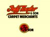
Have a look at my atempt!!
The vehicle is a cream colour and the colour requirements are Burgundy, Red, Gold and Black.
The logo is for the doors and bonnet (hood) and it will also require a rope circle with JT & Son intertwined into it.

Cheers
SC
 

Attachments

  • j t.jpg
    j t.jpg
    30.1 KB · Views: 116

Gino

Premium Subscriber
Agreed 100%.

Besides, no one hand-painted a carpet truck like that back then.... even in England. :brittain:

Google up some old pictures, I'm sure you can find some and maybe you can find something a little closer to the era.
 

Marlene

New Member
Google up some old pictures, I'm sure you can find some and maybe you can find something a little closer to the era.

+1
if you had said nothing, I would never have known this was to look like 60's/70's. signs from that era have a look that is pretty universal. try a search for vintage signs from back then and if you don't find much try looking at movie posters from that era as the fonts used on them would work.
 

Jillbeans

New Member
I'd try something using the alphabets of Arthur Vanson (available on Letterhead Fonts) since he grew up as a signwriter in the UK in the 1960s.
He based a lot of his layouts on those of Cecil Wade.
http://www.letraset.com/shopcontent.asp?type=profileCecilWade
Here's a quick suggestion.
You could turn the swooshy thing I used into a roll of carpet if you wanted to.
Love....Jill
 

Attachments

  • Untitled-1.jpg
    Untitled-1.jpg
    214.3 KB · Views: 90

SignManiac

New Member
Very nice Jill. Good job on capturing the sign painted look of the 70's. Reminds me of many I painted in that style back in the day. No computer fonts were used back then.
 

heyskull

New Member
Yes I realise the font choice was awful.:Big Laugh
I was just mainly trying to show what text their was to be in the logo.
The logo just needs wording no pictures etc.
I am trying to get it looking like a old UK sign written truck.
No swooshes etc.
I like Jills ideas but it just isn't old time looking.
John is maybe going somewhere but I am maybe starting to think script styles are not legible enough.
Also the name has the two most unreadable capital letters in a script style (J and T).

I realise how hard it is to get that look now with computer generated graphics.
I thought this would be easy as all I would have to do is look back on some of my old jobs going back 25+years.
But things have come on so much, and everyone wants modern I really have hit a wall on this one.

SC
 

toucan_graphics

New Member
I don't know if you still need help but thought I would submit some ideas. These would need kerning help and some other design elements to tie it all together but some font style ideas nonetheless.

jeff Taylor & Son.jpg
 
Top