-
I want to thank all the members that have upgraded your accounts. I truly appreciate your support of the site monetarily. Supporting the site keeps this site up and running as a lot of work daily goes on behind the scenes. Click to Support Signs101 ...
You are using an out of date browser. It may not display this or other websites correctly.
You should upgrade or use an alternative browser.
You should upgrade or use an alternative browser.
Ice Cream Parlor Layout Critique
- Thread starter TheSellOut
- Start date

stephenj148
New Member

Nice, I like it
Jim Doggett
New Member
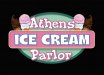
Hey guys, wanted to see what you all thought on this layout! Ice cream cones are modified clip art and this will first be used as a window decoration and eventually a sign that will be cut to shape.
I think it works and looks nice. Athens and Parlor have prro readability due to low contrast. But ICE CREAM pops, and leaves no doubt you can get a cone from these guys.
So muting the Athens and Parlor is probably a benefit.
Good job, IMO.
Jim
ddubia
New Member
I love everything about it except Athens and Parlor being the same font and color. For some reason I couldn't help reading "Athens Parlor" when I first opened it.
But the colors are slam dunk and appropriate. Ice Cream has just enough of the right treatment that enhances it without going overboard. The layout is great.
But the colors are slam dunk and appropriate. Ice Cream has just enough of the right treatment that enhances it without going overboard. The layout is great.
signmeup
New Member
I'd consider simplifying it a bit. Maybe even go more retro with the colours.
Trying to avoid work today.....
I tarted up my idea with some drop shadows and a shade to simulate a 3D sign. "ICE CREAM" would be on a big gentle curve.
Trying to avoid work today.....
I tarted up my idea with some drop shadows and a shade to simulate a 3D sign. "ICE CREAM" would be on a big gentle curve.
Attachments


Last edited:
TheSellOut
New Member
Thanks for everyone's input so far. I really like Signme's oval in the background, which is funny cause I tried that originally an didn't like it, but after seeing his I decided to try it again! I do like the colors but I might try messing with the "Athens/Parlor" font and color. Signme, what font did you use? I like that too!
Attachments

Sticky Signs
New Member
I like the oval too. I really like the effect in the words ice cream. very cool.
rjpjr
New Member
regarding the original post, I really like the overall feel except the negative space at the bottom on each side of Parlor bothers me a little. Maybe arch the main copy to reduce that negative space. I agree with the others comments concerning the Athens and Parlor typefaces. Also, maybe the text could use higher contrast. A quick throw together to show shape possibilities only...
IMHO, The oval design may be a little bit too busy. ??
IMHO, The oval design may be a little bit too busy. ??
Attachments

J Hill Designs
New Member
I'm a fan of post #8
ActualGrafix
New Member
Try changing the Athens Parlor font. Your eye gets drawn to the Athens Parlor first which makes it . . . . Athens Parlor Ice Cream
Other than that it looks great
Other than that it looks great
JR's
New Member
It's looking really good,
what I would change is Athens rotated counterclockwise a little bit and then bend it a little bit. Make it a tad bigger.
Ice cream looks good a little drop shadow would make it pop a little more.
Parlor change that to a simple sans serif letter style. With caps and have it just on the back oval.
Where did you get the clip art of the ice cream cones thay look really neat.
JR
Ponto
New Member
I'm a fan of post #8
I agree... (aside from the mirrored cones) ... the text flows and works together instead of the separated linear look of the other offerings...
JP
Craig Sjoquist
New Member
waiting to see the next one cause ya got such a good start with great suggestions this logo will be dyno-mite kewl