-
I want to thank all the members that have upgraded your accounts. I truly appreciate your support of the site monetarily. Supporting the site keeps this site up and running as a lot of work daily goes on behind the scenes. Click to Support Signs101 ...
ID
- Thread starter Colin
- Start date
Johnny Best
Active Member
Here ya go, It's not a match but driving by at 50mph it will look fine. NitpickFriday

Johnny Best
Active Member
It's perplexing why so many assume what this font ID request is for, and its importance. It is not for a sign, nor for a customer of mine. Who or what it's for is irrelevant, just hoping to identify the font.
Now you have tweeked my interest. Did you make up a new parlor game with the font printed on the front of the card and you hold it up for the opposing player to guess which font it is? And you needed to know the name of the font to print on the back so the person holding the card would know if they are right or wrong? Are you going to call it FontFun?
Colin
New Member
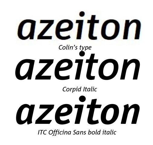
I revise my earlier corpid selection. This one when imposed over your sample fits spacing and slant perfectly. I did shorten it slightly which rounded the "o" more and fit perfectly as well. Such fun!! Corpid-iii/e1s-semicondensed-bold-italic
It’s darn close, but not exact. Here’s the differences between the sample and Corpid Semi Cond Bold Italic:
Needs to be slanted backwards 3 degrees to match sample.
It is a little fatter than sample.
The diagonal stem of the “z” is at a different angle.
The upper bowl of the “e” is different.
The termination of the tail of the “e” is different.
The top of the stem of the “t” is taller with Corpid.
The top/left edge of the top of the stem of the “t” is angled with Corpid, not in sample.
The bottom/termination of the “t” is different.
So, perhaps someone started with Corpid and made all of those modifications, but I would tend to doubt that. We know that in these days of hundreds of thousands of fonts, some are painfully similar.
Gino
Premium Subscriber
It's perplexing why so many assume what this font ID request is for, and its importance. It is not for a sign, nor for a customer of mine. Who or what it's for is irrelevant, just hoping to identify the font.
Wow. Just plain wow. You come here about once a month looking for weird type styles and fuss about things not being 100% when they're about 99.9% spot on and you give us sh!t for asking about simple questions ?? Please don't share your needs other than your dire need to know something without expressing yourself fully. It's just beneath you to further help us find your silly types styles or needs due to your tight grip on your........ whatever it is you need.
Ya know, sometimes it helps to share BACK.
Johnny Best
Active Member
I would like to be around when Colin's wife or girlfriend asks him "how do you like this dress?"
Texas_Signmaker
Very Active Signmaker
Collin has quite an attitude on here for getting free help. Would love to know what this is being used for.
Medina Signs
Old Member
Seriously... I read the most popular post everyday, but I usually don't read post looking for a font ID because when I have in the past in the hopes of being helpful, the font has been Id'ed several times already. Maybe I should get up earlier or read the forum while I'm on the pot... I digress...
But I'm glad I read this one... you guys can be very entertaining.
But I'm glad I read this one... you guys can be very entertaining.
