-
I want to thank all the members that have upgraded your accounts. I truly appreciate your support of the site monetarily. Supporting the site keeps this site up and running as a lot of work daily goes on behind the scenes. Click to Support Signs101 ...
You are using an out of date browser. It may not display this or other websites correctly.
You should upgrade or use an alternative browser.
You should upgrade or use an alternative browser.
idea for our new logo
- Thread starter signguy35
- Start date
J Hill Designs
New Member
no brainer top one
Mega Format
New Member
Top looks great.
piccadillysigns
New Member
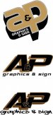
#1 without the &

James Burke
Being a grandpa is more fun than working
Sure you want to go with A&P?
Maybe one of these will give you some ideas.
That was what came to my mind.
JB
SignManiac
New Member
Have to agree with others. Top one with some more refining.
James Chrimes
New Member

SAR.Summerlin
New Member
I like the idea of the top one also. I think the over dark shadows on the bottom ones throw them off. Try a lighter shade. The word graphics before signs also seems odd. The statement above is correct about the &'s.

I like this one. neither of the original options are working. I would scrap and start over. If you are using A&P just because of the website how about apgraphics-signs.com or something like that. I don't think you need the double & even if one is and the other & still not working.
Sign Up Graphics
New Member

Pixels Are Bad Mmmkay?
New Member
Same response here. The top one for sure. I pretty much like it just the way it is, more or less. A little tweaking and you will have something good. To me the angle screams creativity and approaching things outside the box.
The bottom two aren't great, but I do like the A&P on the bottom one as opposed to the middle one. And about the sub-copy on the bottom one...Ouch! Even Comic Sans might look better and more refined than that inner city subculture crap. That would project anything but professionalism to me.
The bottom two aren't great, but I do like the A&P on the bottom one as opposed to the middle one. And about the sub-copy on the bottom one...Ouch! Even Comic Sans might look better and more refined than that inner city subculture crap. That would project anything but professionalism to me.
genericname
New Member
Top's the closest to the mark. I'd lose the ampersand, as it's too close to the grocery chain.
The bottom one even being considered would have me revisit my relationship with the business partner.
The bottom one even being considered would have me revisit my relationship with the business partner.
well im not in canada so i have no idea what grocery chain that is. but i took some of your ideas. less tilt added "and' and made the signs plural. i like to design in white and black to keep it simple then add color to pop. the top is the original then the bottom two are just some different tweaks. thanks for the honest replies.
