• I want to thank all the members that have upgraded your accounts. I truly appreciate your support of the site monetarily. Supporting the site keeps this site up and running as a lot of work daily goes on behind the scenes. Click to Support Signs101 ...

Illustrator Pantone Solid Coated Swatch Color Issue

Tabaka

New Member
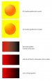
Hi everyone, I have a quick question about Illustrators pantone colors.
I originally designed my logo /business cards in Flexi where the colors
are rich and vibrant. I brought them over to illustrator and for the most past my
colors are about the same. I have a small gradient in a circle image (see
my avatar). Then I started thinking and decided I should definitely choose
pantone colors for my logo rather than an orange and dark blue fill in
Flexi. So I opened my solid coated pantone color chart and chose Orange
021C and Reflex Blue. I opened the pantone swatch library in illustrator and
triple checked that solid coat was selected. Well the colors are super
light and not close at all. I know that monitors can play a big part with
colors. I made sure that the fill was at 100% for the blue and orange. The
gradient is a whole other matter & I'm going to play around with that.
Anyways I just wanted to see if anyone has advice or know what's going
on. I can probably just send the EPS file to the business card printing
company and let them know the exact PMS colors but am also thinking
about PMS color proofs in the future for clients.

I will post what I'm seeing on the screen if you like.

Thanks :thumb:
 

Sign_Boy

New Member
What color profile are you working in?
CMYK or RGB?

If you are going by your color guide there should be no problems when you go to print.
But I'd tell the printer the numbers to be on the safe side.

One quick side question.
What process are you going to use to print these?
If you are using spot colors and printing CMYK I'm thinking the colors are going to shift.
 

Tabaka

New Member
I'm using colorprintingwholesale.com (same company as Uprinting.com) over in California.
They are my wholesale vendor for printing paper media. I'm about 98.5% sure they are
using CMYK. I'm going to send them PMS colors in a note with my order.
 
Last edited:

Sign_Boy

New Member
I'm using colorprintingwholesale.com (same company as Uprinting.com) over in California.
They are my wholesale vendor for printing paper media. I'm about 98.5% sure they are
using CMYK. I'm going to send them PMS colors as well in a note with my order.

That color is going to shift then.
021C = C 0 M 68 Y 100 K 0
It's kind of a muddy Orange

You are better off designing in CMYK if you are using a printer like that.
This way you know what you are going to get.
JMO

Back to the OP. It's probably the monitor that's causing the color to be so light.
 

GypsyGraphics

New Member
I'm using colorprintingwholesale.com (same company as Uprinting.com) over in California.
They are my wholesale vendor for printing paper media. I'm about 98.5% sure they are
using CMYK. I'm going to send them PMS colors in a note with my order.

Tabaka, if you send your printer a CMYK file, you shouldn't expect them to try and match a spot color. That something you need to do before sending them the file.

If know that you'll need a CMYK color that will have a comparable spot color... start with that in mind. Take a look a the different oranges in a Pantone Solid to Process guide. Your choices are limited, most of the orange shade don't have a comparable CMYK/PMS, but there are a few where the color shift isn't too bad. The brighter the orange, the less likely you are to find an acceptable CMYK equivalent.

If your not expecting to ever print spot colors... just ditch the effort to match a PMS color. These days, it's more expensive to print a couple of spot colors the full color.
 

dbenec

New Member
some additional food for thought................blending 2 colors will often lead to a weak mid gradient area.

i've done the attachment as 021 to yellow set to normal transparency. changing the transparency to multiply helps get the saturation i think you're looking for.

also see the same happens with red to black. the fix there is:
a) set a black to white gradient to multiply over solid red
b) blend from red to rich black (100m 100y 100k) instead of black only.

hope that helps some.
 

Attachments

  • gradients.jpg
    gradients.jpg
    22.9 KB · Views: 183

Tabaka

New Member
some additional food for thought................blending 2 colors will often lead to a weak mid gradient area.

i've done the attachment as 021 to yellow set to normal transparency. changing the transparency to multiply helps get the saturation i think you're looking for.

also see the same happens with red to black. the fix there is:
a) set a black to white gradient to multiply over solid red
b) blend from red to rich black (100m 100y 100k) instead of black only.

hope that helps some.

Worked like a charm. I learn something new everyday on 101 :thankyou:
 
Top