• I want to thank all the members that have upgraded your accounts. I truly appreciate your support of the site monetarily. Supporting the site keeps this site up and running as a lot of work daily goes on behind the scenes. Click to Support Signs101 ...

In Memory of...

Jillbeans

New Member
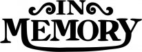
I have to make a paint mask for my friend.
It's for his client, whose only request is that it say
IN MEMORY
DAD
(not in memory of Dad)
It is for a Triumph tank.
I was wondering if it would be cheesy to make some of the letters extended into the others sort of like the Triumph logo.
But the R is too close to the end to make it "official".
I was thinking of making the M in Memory having a long leg connecting into the Y.
Or should I just go with something simple/dignified?
Total area is about 4"x4".
Love.....Jill
 

Attachments

  • Triumph.jpg
    Triumph.jpg
    37.1 KB · Views: 101

iSign

New Member
Maybe if you use upper & lower case letters, having a "y" that sweeps back to meet the tail of lower case "n" in the word "In" would work?

Is the triumph logo on the bike somewhere?
 

Bigdawg

Just Me
Not too cheesy, but the connect looks forced, not sweeping like the triumph logo. The M and Y in that font doesn't curve to make the swoop natural-looking
 

Jillbeans

New Member
No logo on bike.
My buddy's going to paint it in silver then give it a fire red outline.
The bike tank is a deep reddish purple with a fire red pinstripe.
last night when he brought the tank over, my friend asked what I thought of the paint job.
I told him it seemed a bit duller than matte (it will be clear coated) and wondered what the flecks in it were, as it did not appear to be a metal flake.

It's the ashes of the dead man, whom I've known for many years.
I made my friend take the tank with him.
Now I'm struggling with a script for "Dad".
 

Marlene

New Member
tail into the "R" from the "M" instead to make the cross bar in the R sort of like what the bike lettering does in the top example where the tail of the "T" makes the cross bar of the "H".
 

Bigdawg

Just Me
tail into the "R" from the "M" instead to make the cross bar in the R sort of like what the bike lettering does in the top example where the tail of the "T" makes the cross bar of the "H".

:goodpost: Good eye - what she said Jill!
 

Jillbeans

New Member
Think I'm gonna can this idea and just go with a nice script.
:tongue:
 

Attachments

  • ernie.jpg
    ernie.jpg
    213 KB · Views: 111

Jillbeans

New Member
Next time I wanna try something cheesy tell me not to.
I think this is more appropriate.
The other one seemed like I was trying too hard.
(this is in the colors of the tank...sorta)
 

Attachments

  • ernie.jpg
    ernie.jpg
    205.8 KB · Views: 124

petesign

New Member
Jill, the end looks nice. I am just happy to see that you are human.. I always admire your work on here - and it's reassuring to us keyboard mashers to see that even the best of us have difficulty sometimes. :thumb:

hehehe
 

Marlene

New Member
It is for a Triumph tank.

don't forget that it is for a bike tank. the last one is nice but really girly. it needs to man up some. your other idea wasn't all that bad it just needed some tweeking. if you do decide on script, look for one with a thicker stroke and more manly man looking or one that looks more like pinstripe to fit in with theme.
 
Top