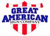
Realizing that most people, even those in these waters that ought to know better, wouldn't know good typography if it bit them in the butt, this is a textbook exercise in bad typography.
Forget the dubious kerning advise you're received thus far and rather than move the 'T' closer to the 'A' as you have done and, in the process, mortally wounded the type body of the 'A'. Rather move the 'AT' a smidge to the right, away from the 'E". Balance it that way, not by violating the 'A's space with the top bar of the 'T'. This is one of those things that just because it's soft type and you can do it, you should not. Poor typography. Never invade the type body one character with another unless you're using some type face with radical features, like the bottom swoosh on a 'Q' or something else that extends above or below the actual character height. It makes you look like an amateur. Not the sort of thing you'd want hawking a sign shop.
Likewise the 'A' and 'N' in 'AMERICAN'. Unweld these two characters from their neighbors. Make them a taste taller if you have to and do not let the ' N' and 'E' violate their type bodies.
A lot of people here will say pish and tush to this advice, but they merely demonstrate their ignorance of proper typography.
Then drop 'SIGN COMPANY' down a bit. It's jamming into the words above. Let those characters breathe a bit. And find another type face for it. Preferably one without serifs. Two different and distinctive serif styles that close together looks more confusing than enlightening. It's visually discordant as it is.
In general no character should ever try to occupy any part of the bounding rectangle of another character unless you have a real good reason for doing so. You don't. Pay no attention the the legions of the aggressively ignorant who will invariably cry "This isn't the last century" or some sort of equivalent uneducated nonsense. Good typography transcends time and equipment and remains good typography. Just as in music where proper chord progression is timeless and is one of the things that separates music from noise.
Thus endeth the typography lesson.
Then consider the colors you have chosen. Maybe a deeper red and a deeper or just less electric blue. Or a lighter blue with a deeper blue outline. Right now it remotely looks like a washed out Union Pacific logo with a too thin and bilious red outline on the blue text. The current colors are somewhat less than optimum. Perhaps you might want to see what a red gradient from really deep red to plain vanilla deep red looks like as well.
The you might try not breaking the shield in two. It might look a bit more tied together if you left the shield in on piece and added a white outline to the text to provide a visual separation from the bars. Right now it looks like a couple of sets of vertical bars and some text all of which is just floating around. Another source of possible visual discord.