• I want to thank all the members that have upgraded your accounts. I truly appreciate your support of the site monetarily. Supporting the site keeps this site up and running as a lot of work daily goes on behind the scenes. Click to Support Signs101 ...

Is this too corny?

abadsvt

New Member
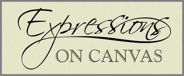
Hi everyone. We have been printing alot of canvas prints for local people lately and we are thinking about getting a website going to possibly pick up a few more customers. So i have been playing with a logo and put this together. I wasn't sure if it looks too corny. Logo design isn't my strong suit but i to try. What do you think of this? Any feedback would be great.

Josh

ps. A little background about the company is we take your photos and print them on high quality canvas then stretch on a set of stretcher bars. So the prints are ready to hang when people pick them up.
 

Attachments

  • logo.jpg
    logo.jpg
    636.9 KB · Views: 138
Last edited by a moderator:

Ghost Prophet

New Member
Seems good to me. Maybe underline the "on canvas" or add another bevel to the very bottom as you did on the right side.

Also never be afraid to mix fonts on capital letters for logos.
 

Craig Sjoquist

New Member
I like the expressions script and the canvas caps good simple laout of 2 words, ...what I don't like is those curlies on the N's & V not needed you have the beautiful script, yes bevel 2 or 4 ends
 

Jillbeans

New Member
Yes definitely trim those nose hairs off of the ON CANVAS part.
You don't need them.
Try Valentino for the script.
I am sooo tired of seeing Scriptina, it's going to be dated in about 2 weeks.
Love.....Jill
 

signmeup

New Member
I don't think that's a bevel. I think it's meant to be a 3d canvas stretched over a frame. Doesn't need it though.
Another vote for "lose the nosehairs".
 

abadsvt

New Member
I took off those things on top of the "on canvas". This look better. I will play with it to give it another bevel on the top. Besides that what do you guys like it? It seems like everyone except jill :) likes the font. Anyone have any ideas on something that might look a little classier or is what i have good. Thanks

Josh
 

Gino

Premium Subscriber
The canvas looks more like a cement block.

Your perspective looks a little off, too. Usually when looking at something with a return like on the right side, you'll have some of the same top or bottom.... depending on where your eye is on the horizon line.

Try giving a little more depth and creating more of a canvas texture to your background.

Remember, when someone glances at something, it helps if you exaggerate it to look as you want it to in a snap.
 

Jillbeans

New Member
I did make a suggestion.
Why would you want to use a script that's real popular with crafters and as overused as Papyrus when there are so many lovely scripts in the world?
Glad you lost the nose hairs.
:wink:
 

Attachments

  • Graphic1.jpg
    Graphic1.jpg
    49.8 KB · Views: 132

abadsvt

New Member
I did make a suggestion.
Why would you want to use a script that's real popular with crafters and as overused as Papyrus when there are so many lovely scripts in the world?
Glad you lost the nose hairs.
:wink:


Jill,

I was just going to ask about what that font would look like (valentino) with Expressions typed out. The only place I found that font I had to purchase it to see what it looked like. I like it alot. Its a little harder to read but very nice. I also really like that last font you picked. I will get the bosses (my wife) opinion and see what one she likes. Thanks for the help Jill!!!!!!

Josh
 

Fitch

New Member
Scriptina is a nice "hand drawn" style font, but when you get three "s"'s in there that are all the same, it totally undoes the style.

Convert to vector and manipulate the nodes so each letter looks individual, the way the original script was no doubt intended. Adjust the kerning - some tight some loose.

Cheers - G
 

Jillbeans

New Member
Yeah I always fiddle with the nodes, I only fiddled a bit with these Ss.
If you have 3, do try to change them up just a tad.
The last font is by Chuck Borges, a totally spectacular guy and font designer.
http://www.myfonts.com/person/Charles_Borges_de_Oliveira/
PS
consider font purchase like you would a good tool.
You'll use it more than once.
(in my case I use Chesham Sans wayyyy too much)
 
Top