-
I want to thank all the members that have upgraded your accounts. I truly appreciate your support of the site monetarily. Supporting the site keeps this site up and running as a lot of work daily goes on behind the scenes. Click to Support Signs101 ...
You are using an out of date browser. It may not display this or other websites correctly.
You should upgrade or use an alternative browser.
You should upgrade or use an alternative browser.
Its critique time.
- Thread starter Flubber
- Start date


Rick
Certified Enneadecagon Designer
how much research have you done... there are a million cool soccer logos.
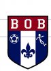
One, the stick dude does not go with the other graphic elements, it's too "lil' kiddie" looking, if they insist on that lame dude, it will take a miracle to make that logo look presentable..
The soccer ball seems too detailed.
BOB is the wrong typeface, use a bold, sporty san serif typeface...
And the biggest mistake I see (and too many times...) tone down the red white and blue to a darker red and blue. Look at the colors (and the ball) of the US soccer logo... still red, white and blue, but the colors and simplified ball make it clean.
http://en.wikipedia.org/wiki/File:US_Soccer_logo.svg
SignManiac
New Member
Rick knows his $hit. Heed his valuable advice.


Flubber
New Member
With that stick man, all you are doing is polishing a mushy turd... if it were me, tell the guy to take a hike, or do it and collect the check...
imma collect a check on this one..lol
Moze
Precision Sign Services
No offense to you since its customer-driven, but I thought the stick man was a placeholder...like 'this is where the real image will go once it's decided on'. That's horrible, it looks like it was drawn with a finger on an iPad or something. I agree with MikePaul, the ball and fleur de lis should be opposite each other with the player in the center. I can't believe the customer is cool with that stick figure.
SignManiac
New Member
If push came to shove, this is how I would tackle it. The fluerdeles and soccer ball are close in size so I would keep them side by side so that there is an overall balance in the design. I'd definitely trash the stick figure and go with something that at least resembled a soccer player and had a little more weight to the design than a stick figure.
So even your turd can be polished a little bit.
So even your turd can be polished a little bit.
Attachments

Last edited:
Wiggum PI
New Member
add prawns and a dark alley and you have your answer...I think your customer (after paying you, of course) needs to be beaten about the head and shoulders with a 10# bag of rotten potatoes.
Love....Jill
Flubber
New Member
I only charged the guy my 2hr min so i wasn't about to email back n forth back n forth. I put in what he ask me to and did the best i could with it. The reason for the stick man is bc he says "we are just a bunch of stick guys"......what the he$$ does that supposed to mean???? It was like he wanted no creativity just stuff thrown together. But hey i was paid within an hr after i sent the proof to him so I'm not complaining.