-
I want to thank all the members that have upgraded your accounts. I truly appreciate your support of the site monetarily. Supporting the site keeps this site up and running as a lot of work daily goes on behind the scenes. Click to Support Signs101 ...
You are using an out of date browser. It may not display this or other websites correctly.
You should upgrade or use an alternative browser.
You should upgrade or use an alternative browser.
Just for giggles
- Thread starter Flubber
- Start date
J Hill Designs
New Member
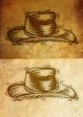
the cowboy hat looks very corel clipart-y
Flubber
New Member
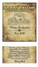
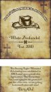
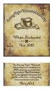
Customer loves it. But i want an opinion from you guys. Dnt hold back... I personally Dnt like the white but that's what they wanted bc it matches all the banners that was done previously.
And i know that (White Zinfandel isnt centered correctly in this pic but the proof is

Flubber
New Member
the cowboy hat looks very corel clipart-y
I just had to go with what the company im working for used in the past. So im stuck with using it.
bob
It's better to have two hands than one glove.
The LHF Boston Truckstyle is locked in a death struggle with the LHF Orchard. Thou shalt not use two specimen type faces in proximity to each other. Especially when they are as incompatible as these two.
That and soften the cowboy hat just a taste.
That and soften the cowboy hat just a taste.
Flubber
New Member
The LHF Boston Truckstyle is locked in a death struggle with the LHF Orchard. Thou shalt not use two specimen type faces in proximity to each other. Especially when they are as incompatible as these two.
That and soften the cowboy hat just a taste.
How about this?
Attachments
bob
It's better to have two hands than one glove.
How about this?
It's not the color of the hat that's the problem. Distress it some and blur it just a little bit. It's way too sharp as it is.
Pixels Are Bad Mmmkay?
New Member
I would drop the hat down a bit over the top of White Zinfandel and then make the copy at the top larger and divide it into two lines something like this...
Sammy Taylor
Memorial Scholarship
...so it's larger and reads better.
Sammy Taylor
Memorial Scholarship
...so it's larger and reads better.
xxaxx
New Member
Bob is right ... the hat is really distracting ... If using PShop, I would suggest adjusting the background image a bit so that there is a bit more texture directly under the hat and then guassian blurring the hat a touch to soften the edge and then switch the blending mode on the hat to something like multiply or overlay so that the background texture shows through and grunges up the hat a bit. That will help give the hat a look like it was printed on the really old paper background and should make it less distracting. Also when I do that with a grungy background like that I like to also add in an outer glow of black set to multiply with the noise value turned up a little bit and then play with the opacity of the glow ... it usually adds a nice little extra detail.
xxaxx
New Member
Sorry for the double post, but here is a quick example I threw together for you so you can visualize what I was trying to explain. I set the hat to overlay, its a bit hard to see the detail when its this small, but at full size you can see all the grain and grunge from the paper background showing through on the hat, which gives it some good variance in color tones as well.