-
I want to thank all the members that have upgraded your accounts. I truly appreciate your support of the site monetarily. Supporting the site keeps this site up and running as a lot of work daily goes on behind the scenes. Click to Support Signs101 ...
You are using an out of date browser. It may not display this or other websites correctly.
You should upgrade or use an alternative browser.
You should upgrade or use an alternative browser.
Landscape design
- Thread starter Pinfinity
- Start date
Craig Sjoquist
New Member
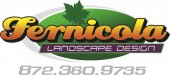
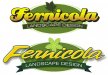
The main name needs a white outline between the letter & dark green outline & shade to put life into word.
Gino
Premium Subscriber
Too much italisisms and that second line of copy is too hard to read and doesn't lend itself to landscaping. The big numbers don't have a sense of being connected with anything. The use of those big numbers are puzzling. There's some other things going on, but let's fix the easy ones first.
Jillbeans
New Member
It's very dark, lacks contrast, and has a lot going on, busy looking.
I'd eliminate the heavy black shadow on the name.
Make sure, if using italics, that they have the same slant. The landscape font looks very space-agey and does not compliment the script font.
"What they do" seems to have the least emphasis. Sometimes I will make the name stand out, but what they do needs to be easily discerned.
Your color palette is also not complimentary, and I think you have too many colors going on.
I would stick with green tones, as these seem to appeal to landscapers.
Use a leaf, or use an oval, or use panels, or use gradients, but don't use them all at once.
Love....Jill
Marlene
New Member
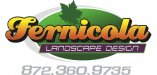
Too much italisisms and that second line of copy is too hard to read and doesn't lend itself to landscaping. The big numbers don't have a sense of being connected with anything. The use of those big numbers are puzzling. There's some other things going on, but let's fix the easy ones first.
+1
with all you have going on there is no need for the gradient. it overpowers the design and jus makes it look too overdone. the overall idea of it is nice. I even like the gray swoosh. the greens are nice too. not loving the font used for the landscape design. it is way to fussy and needs to be less complex.
Signmaker1234
New Member
Black and white
What does it look like in black and white?
What does it look like in black and white?
Gino
Premium Subscriber
What does it look like in black and white?
Not hard to imagine, but here ya go........

SignManiac
New Member
James Burke
Being a grandpa is more fun than working
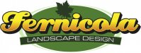
Instead of a gradient, how about a bit of prism on the name?
JB
JB
SignManiac
New Member
Jillbeans
New Member
Better...but try changing that inner pinline outline on the script to white, straightening the panel for landscape design, try the panel itself in black, fix the weird area (not smooth) in the r (where the e joins the r)in the name, and I think the idea of a fern rather than that leaf has some merit.

bob
It's better to have two hands than one glove.
'Fernicola' is not a word that a lot of people have ever experienced. That being the case, putting it in a script, especially that fat thing with the ugly 'r', is merely making it more illegible and incomprehensible than it already is.
People seldom actual read words, they see them and attach some sort of meaning to them en passant rather than actually reading the letters. That's why you can drop letters, misspell words, use dubious grammar, and still make yourself understood. By putting an unfamiliar word in a script or other difficult type face you have increased the number of people who will never read it or remember it.
Do your client a favor and try some other typographical approach.