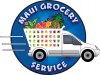
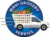
I like the weight of the first one but the lettering on the second one, what I mean is the way Maui Grocery on top looks kinda heavy with just service on the bottom,
what if you bumped up maui on the top and moved Grocery to the bottom and maybe stacked it ..
//chopper
wanted to thank Chopper, Signcrafter & Dave for their variety of contributions as well. Overall, I'm glad the second one got a few votes because I did that layout first & emailed it while the graphics were still in rough form.
The client liked it, but as I developed the rest of it I wanted to try to group the copy (somewhat like Dan's "not necessarily integrated typography" comment) so it could stand alone at times, on a truck door for example, or a low cost 1 color promotional item...
...so last night I sent the first layout in the more completed form shown here & the client wanted me to go back to the circular lettering he had seen earlier... hence the more completed version 2 above...
Anyway, I may try some of the "dumbing down" ideas for my own learning experience, because I see the value... but if the client approves version 2 as is, I will let it go out the door like that...
That's the other part of why I think I can make the transition to charging higher prices... because for me, it just takes too long to get this far, and to take it further without charging for the time will result in me doing something like delivering groceries instead of logos, if I'm not careful!
(not that there's anything wrong with that!)
....and I want to be able to take things to the next level, so anticipating that amount of time, AND anticipating that the true value to the client will be increased exponentially when I have that much more time in the budget...
that's it... my New Years resolution!!!! Now offering $1000 logos at Island Sign
"because you're worth it"