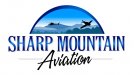
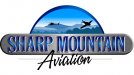
Hey Guys. Just finished a preliminary logo for a small mountain town based helicopter and small plane training facility. He specified a few things such as a plane, a helo and a mountain scene since Jasper, GA is "The Mountain City". What do you guys think of this before I send it to him?
-
I want to thank all the members that have upgraded your accounts. I truly appreciate your support of the site monetarily. Supporting the site keeps this site up and running as a lot of work daily goes on behind the scenes. Click to Support Signs101 ...
You are using an out of date browser. It may not display this or other websites correctly.
You should upgrade or use an alternative browser.
You should upgrade or use an alternative browser.
Logo Critique
- Thread starter SEOR
- Start date
J Hill Designs
New Member
TheSellOut
New Member
I like it too and I agree with Marlene on the navy blue. Also take out the two white dots below the windows of the heli and maybe try a windshield on the plane with a white to light blue gradient
it's pretty! I love the graphic with all the blues. the only thing I would suggest it to change to black plane and helo to a dark navy blue and maybe try Avation in the same dark navy. the black is good too.
Funny you mention it. I originally went with navy on the plane, helo and Aviation, bit after looking at it, it looked real BLUUUUUUUUUUUUE. :Big Laugh
Marlene
New Member
Funny you mention it. I originally went with navy on the plane, helo and Aviation, bit after looking at it, it looked real BLUUUUUUUUUUUUE
maybe but the bluuuuuuuuuuuue is so pretty

daveb
General Know-it-all
If I may be so bold
Just my antiquated layout technique but I don't like to see a graphic hanging out in mid air, I like to sit it on something. Not that I don't like what you've got but I think you're looking for suggestions, not a pat on the back. I could play around with the "Sharp Mountain" a little to make it stand out better but I think you'll get the idea.
Just thinkin' (I do that too much):Big Laugh
Attachments
mollygrubber
New Member
Stupid thought... but, could you make the plane going up instead of coming down?
bob
It's better to have two hands than one glove.
Nice sign but a dubious logo. Way too much detail and gratuitous effects.
Why is it that whenever a sign maker attempts a logo or a business card, it usually looks like a sign and not a logo or a business card. Perhaps the average sign maker has little aptitude for dealing with small areas.
Why is it that whenever a sign maker attempts a logo or a business card, it usually looks like a sign and not a logo or a business card. Perhaps the average sign maker has little aptitude for dealing with small areas.
I agree with most of the comments here. The blue makes it feel very crisp and cool, (like mountains I suppose). I do agree that the plane needs some white windows or something. It feels heavy without them. The only issue I have is with the script font. I tend to hesitate when it comes to script fonts because the message can sometimes get lost. Doing vehicle graphics has taught me that a clear, fast read gets the message into the consumers brain pan... clear and fast. Nice work all around, It makes me want to go hiking in the middle of nowhere via..... a plane! 