• I want to thank all the members that have upgraded your accounts. I truly appreciate your support of the site monetarily. Supporting the site keeps this site up and running as a lot of work daily goes on behind the scenes. Click to Support Signs101 ...

Logo critique

Jesse_gvi

New Member
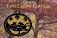
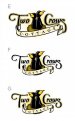
I tried to go "country living" with this one. They sell maple syrup, fresh eggs, etc.

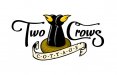
Something doesn't look right about "Crows" I don't know if it's the big "s" or the "C". If I knock off the top of the C, the whole thing slopes down. Any thoughts?

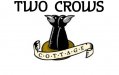
I also attached their original.
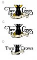
 

Attachments

  • twocrows_logo.jpg
    twocrows_logo.jpg
    33.4 KB · Views: 147
  • twocrowcottage_old.jpg
    twocrowcottage_old.jpg
    82.2 KB · Views: 126

TyrantDesigner

Art! Hot and fresh.
the C looks like an afterthough, try shortening it and losing the loop but keep it long underneath. the second image is a train wreck, like the first one though.
 

GraphixUnlimited

New Member
I like where you are going with it, but id increase the size of the banner underneath and use a different font for the "Two Crows" as its just not working for me but i do think you are headed down the right path with a bit more time spent on it.

Massive.. MASSIVE, improvement from before!!!

cheers eh!
 

Colin

New Member
1) Crows don't have orange beaks. They are black.

2) I like the crow image, but the script doesn't harmonize with it. Try others (not script).
 

Colin

New Member
As their feet are orange (when in reality a crow's are black), I wonder if Disney was actually portraying a different bird in that?
 

Jesse_gvi

New Member
It's funny, if you google "crow", they all have black beaks, but if you google "cartoon crow" it's nothing but yellow/orange beaks.
 

Jesse_gvi

New Member
I don't know, I think it needs the color up top, regardless of what they actually are in real life.
 

Attachments

  • twocrows_logo02.jpg
    twocrows_logo02.jpg
    42.5 KB · Views: 138

Colin

New Member
*shrug*
 

Attachments

  • Two Crows 1.jpg
    Two Crows 1.jpg
    22.9 KB · Views: 128
  • Two Crows 2.jpg
    Two Crows 2.jpg
    25 KB · Views: 106
  • Two Crows 3.jpg
    Two Crows 3.jpg
    25.2 KB · Views: 105

mikey-Oh

New Member
Disney had orange beak crows.

Mr. Bluebird on my shoulder....
I like the first and the developments. Always encouraging to see progress in these kind threads. Are you married to the bulletins in c•o•t•t•a•g•e•s?
Kinda messes with me... Yet I'm a paradox of the average consumer. Looked at logos for too long, not sure what I believe as truth applies to alles.
 
What would it look like if you lengthen the banner a little so that it starts on the other side of the T, but still ends in the same place on the right side? Just seems a little out of balance.

And I like the beaks as is. If cartoon people always have four fingers, then cartoon birds can have a little extra color.
 

petesign

New Member
I like option B in your last post. Maybe do a little something so they don't look like salt and pepper shakers on a plate.. some sort of wing maybe?
 

iSign

New Member
Agree with larger banner/scroll but still centered, like wrapping back around base of T on left and curling back from behind S at right. This allows Cottage to be bigger, which, of course IS what they are selling, and therefore of Primary importance, even if secondary in placement...

Also agree to work on crows.. Salt shakers is true... Much too static and similar, maybe one should be taller, like a typical couple (their client base, I'd presume) not twins...

Font is ok, but not great... maybe something cleaner

Nest looks like a bagel... or maybe it is one? ...otherwise a bit of shabbiness on nest instead of on the font choice....

Maybe some radial orange and yellow sunlight behind would help tie it together...

OH!!!... got an idea....
What about a "cottage" behind the crows that is like a coo-coo clock!!
 

iSign

New Member
Last night I dreamed I was taking a coo-coo clock off the wall...

Maybe that means my suggestion was "off-the-wall" :smile:
 

Jesse_gvi

New Member
Yeah, I think it may have been too many elements with a cuckoo clock, but it may have worked with a total redraw.

--I don't like E. Or I just didn't execute the idea well enough.
--I like F. I don't know if the shadow on the name is too much or not enough.
--G borders on too busy with the outline around the name, but it does strengthen it a bit.

The nest is an improvement and I think the wings are low enough to avoid looking like a penguin. Varying their height was definitely the way to go. I like the burst better than the plain radial gradient. It says "good morning".

I changed the dots between "cottage" to the lighter nest brown to set them back a bit, make it more readable.

As for the letter style of Two Crows, I got rid of the Ponderosa-looking cuts, but I'm not ready to abandon it yet.

Thanks for all the ideas. Obviously I didn't utilize them all, but they gave me a chance to think about this one a little differently.
 

Attachments

  • twocrows_logo03.jpg
    twocrows_logo03.jpg
    50.1 KB · Views: 156
Top