• I want to thank all the members that have upgraded your accounts. I truly appreciate your support of the site monetarily. Supporting the site keeps this site up and running as a lot of work daily goes on behind the scenes. Click to Support Signs101 ...

Logo feedback, please.

GoodPeopleFlags

New Member
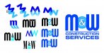
M&W Construction Services. They don't do construction; they're engineers who project manage construction jobs, so they don't want it to look like they do construction. They like Blue. That's about all the info I have. Here are some thumbnails I did. The big one is the one I like so far. This one is difficult because of the name - not much to work with. Anything cool I can do with "M" and "W" is hard to throw in "&".

Any thoughts on these? Any suggestions for something different?

Edited: just saw that the blue is looking really bright! It shouldn't be that way. Shades of colors aren't set in stone. I know logos should be done in B&W first but I can make any of these work in Black (and Gray).
 

Attachments

  • M&W.jpg
    M&W.jpg
    44.1 KB · Views: 71

signmeup

New Member
"M&W Construction.... We don't do construction." If they don't want to look like they do construction, maybe they should change their name to M&W Engineering?
 

HaroldDesign

New Member
I really like how the top left ones mingle. They probably don't need to be on an angle, and the "&" needs to be worked into it better, but how they work together has brand written all over it.
 

Biker Scout

New Member
4th on the right, top row has the most potential as a working logo... you can probably do a blend of the legs and have the M flow into the W's leg. Larger Ampersand gray in the middle to break up the letters visually.

Maybe do some kind of blueprint sketching marks or grid on or near the background, just lightly.

The one you have larger looks more like it came out of some dated sign logo book as an editable example.
 

Marlene

New Member
the top ones on the left look reminds me of Mircle Whip. maybe do a more manly lookly font in charcoal gray and lighter gray with the M fading into a W
 

Biker Scout

New Member
Nothing wrong with a little clever "aligning" with an established look or brand. If it looks or feels familiar, people will somehow remember it, but most will not make the exact connection.

Name off fast food restaurants with Red and/or Yellow in their logos. Yeah, pretty much all of them... Taco Bell is the only one not playing ball. But their Magenta is close.

Take this logo for instance (Gorilla Marketing) While it looks and feels like Gorilla Glue... it's familiar and has a sense of presence because of it. However, if you go and look up Gorilla Glue's logo, it's not even close to being the same. Only a vague similarity in color.
 

Attachments

  • Gorilla.png
    Gorilla.png
    34.1 KB · Views: 65

Marlene

New Member
Nothing wrong with a little clever "aligning" with an established look or brand. If it looks or feels familiar, people will somehow remember it, but most will not make the exact connection.

not always a good plan...it doesn't look exactly like Mircle Whip but when I saw the ones on the top left, I thougth Mircle whip.
 

Attachments

  • miracle_whip_new_logo_design.jpg
    miracle_whip_new_logo_design.jpg
    14.7 KB · Views: 65

Rojo

New Member
I like Biker Scout's idea for #4 on the top line. Play with the colors.
Sell top line #3 to a gynecologist.
 

Jon Aston

New Member
None of it really says "construction engineering" or "construction services", or even "construction" to me. Maybe a little extra design research is called for?

Also, I would suggest a blue (and maybe even a font) that implies blueprints.

Just thinking out loud.
 

Biker Scout

New Member
Sorry... just kinda threw this together. Didn't know what font you used, but this looked close.
Could tweak it a lot more, but this gives you an idea anyway.
 

Attachments

  • M&W.png
    M&W.png
    31.1 KB · Views: 75

Biker Scout

New Member
Again, here's an alternate... now I didn't research blueprints or pull some technical dingbats. Which you should. But just a quickie brain fart that might suggest construction/engineering etc...
 

Attachments

  • M&W2.png
    M&W2.png
    55 KB · Views: 71

Jillbeans

New Member
I like the one in #12.
I kept seeing the old Magee-Women's logo in some of those (Pgh hospital)
Love.....Jill
 

petesign

New Member
This is really rough, I haven't done much with it, but if it gets any ideas flowing, I am happy to contribute.
 
Top