• I want to thank all the members that have upgraded your accounts. I truly appreciate your support of the site monetarily. Supporting the site keeps this site up and running as a lot of work daily goes on behind the scenes. Click to Support Signs101 ...

Logo for a multi purpose business

Haakon

New Member
Hey all

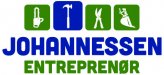
I'm working with a customer now who wants a logo for his company. The company name doesn't say much to towards their lines of work, so I've suggested incorporating some pictograms into the logo to shed some light on the different tasks they perform.

Main thing is carpentry/house building, but they also do garden/yardwork, lumber/forrestery and rent out certain equipment like small diggers and other machinery of that kind. The company name (his surname + entrepreneur) doesn't say much about all that. Entrepreneur over here is usually used for businesses that make roads, bridges, heavy construction etc..

So this is what I've come up with, customer is aboard on the concept, but I don't feel it's quite finished yet. My mindset is very "scandinavian design" since that is where I'm from and how I was taught at design school. But I feel it could look great with some American flair (think signfonts etc), where I always fail to make it look good... Just not in my DNA :) I love the look though.. Eurostile is a safe enough bet (where I'm at now), but I think it could be spruced up a bit, no?

Any thoughs? I'm happy with the pictograms apart from the last one (excavator). It needs to be in that general area, but the design is not cut in stone so far..

Edit: logo with crazy colors removed, attachment in next post.
 

Haakon

New Member
Woah! Colours did not export well!

Let's try again:
 

Attachments

  • Untitled-2.jpg
    Untitled-2.jpg
    37.4 KB · Views: 124

DerbyCitySignGuy

New Member
Yeah, the last icon doesn't read well. The very light green might also be hard to read at distances.

Also, entrepreneur is spelled incorrectly.

[Edit: Never mind. I just put two and two together. Scandinavian name, entreprenør is probably Norwegian or Danish or such?]
 

DerbyCitySignGuy

New Member
You know what, just ignore me. It's still early.

Clearly not paying attention this morning. The darker green looks better and you're in Norway, so clearly the sign is in Norwegian. Haha!
 

DerbyCitySignGuy

New Member
I should have put up a disclaimer! :D

I only had one cup of coffee this morning.

Personally, I like the logo. It's simple, clean, and elegant.

Which is to say, I don't think you need any American flair. The term we use for "American flair" over here in the states is "tacky." ;)
 

Marlene

New Member
it is confusing but tht isn't your fault, it is a jumble of services. if the primary is building then maybe split it so the builder part is the focus and then have the other services. does he do any kind of ads? it would help if he did as he could explain all this in a print ad but not so much on a logo. what you have so far is about as good as it gets
 

Haakon

New Member
It's more of a concept at this stage, all the elements are there but colours and typography are just suggestions so far. It just looked so bland in black/gray. I'm working on a better pictogram for the machine (rental) now.

Carpentry is the main focus (at this point in time) but I suggested that the different parts of the company had "their" pictogram highlighted on the according cars/machinery etc. here are some sketches so far:
 

Attachments

  • Untitld-2.jpg
    Untitld-2.jpg
    41.5 KB · Views: 163

Gino

Premium Subscriber
I'm more for the uneven count of icons along the top. I'm not a fan of even numbered things like that. I think I like the orange and blue set up better, too.
 

shoresigns

New Member
It's more of a concept at this stage, all the elements are there but colours and typography are just suggestions so far. It just looked so bland in black/gray. I'm working on a better pictogram for the machine (rental) now.

Carpentry is the main focus (at this point in time) but I suggested that the different parts of the company had "their" pictogram highlighted on the according cars/machinery etc. here are some sketches so far:

Focus on one concept. Splitting the focus into 4 different ideas does not make a memorable logo. You may have stumbled upon a good idea in the top right where you have just 3 plain boxes of different sizes. I think that's a great, memorable concept that abstractly implies the idea that the business is multifaceted. THAT, is Scandinavian design put into practice - not your generic-looking set of icons.
 

DerbyCitySignGuy

New Member
I'm more for the uneven count of icons along the top. I'm not a fan of even numbered things like that. I think I like the orange and blue set up better, too.

I agree with the orange and blue.

I like the slightly askew aspect of four icons, with one larger. Very wabi-sabi.
 

2B

Active Member
it is confusing but tht isn't your fault, it is a jumble of services. if the primary is building then maybe split it so the builder part is the focus and then have the other services. does he do any kind of ads? it would help if he did as he could explain all this in a print ad but not so much on a logo. what you have so far is about as good as it gets

agreed, the icons are bit much and distracting.

I'm thinking of the large companies,
3M
Nestle
McDonald
Ford

they all have a logo but a list of the services / products are done elsewhere

Looks good to me! Not sure about the light green though!

I think a darker green would be better


Either way, a nice clean design.

The top R corner has the most appeal for me with the staggered sizes
 

Signmaker1234

New Member
It's more of a concept at this stage, all the elements are there but colours and typography are just suggestions so far. It just looked so bland in black/gray. I'm working on a better pictogram for the machine (rental) now.

Carpentry is the main focus (at this point in time) but I suggested that the different parts of the company had "their" pictogram highlighted on the according cars/machinery etc. here are some sketches so far:

I really like the idea of highlighting their pictogram for the different parts of the company! I think that was a creative idea!
 

Haakon

New Member
agreed, the icons are bit much and distracting.

I'm thinking of the large companies,
3M
Nestle
McDonald
Ford

they all have a logo but a list of the services / products are done elsewhere

Yes they do.. but their logo no longer needs to represent their products in any way, these are all brand that were commonly known before most of us were born..

If you say McDonalds now, everyone knows what they do (by reputation, not by branding).. but when they started out from nothing, even they had a logo that represented what they did and where they did it:
 

Attachments

  • mcdonalds1.jpg
    mcdonalds1.jpg
    70.7 KB · Views: 177

rossmosh

New Member
agreed, the icons are bit much and distracting.

I'm thinking of the large companies,
3M
Nestle
McDonald
Ford

they all have a logo but a list of the services / products are done elsewhere


I think a darker green would be better

Either way, a nice clean design.

The top R corner has the most appeal for me with the staggered sizes

You can't use huge brands as a bench mark. They have brand recognition. Most brands start with words or images to represent what they sell. If the brand becomes big enough, they can simplify the logo more and more. It baffles me why people think logos and signs shouldn't tell people about companies. "We're Johnson Industries. We sell rugs and carpet but we're not going to put the word carpet anywhere on our logo because that might make too much sense!"

Examples of brand/logo evolution:
Starbucks: https://s-media-cache-ak0.pinimg.com/564x/b6/e3/96/b6e39661562b77166aa3ff5b51ad7dc9.jpg
McDonalds: http://www.logotreasure.com/blog/wp-content/uploads/2014/08/mcdonalds2.jpg
Ford: http://webneel.com/daily/sites/default/files/images/daily/09-2013/11-ford-logo-evolution-history.jpg
 

TimToad

Active Member
attachment.php


I'm really stuck on the multiple icons feeling really clumsy and not very cohesive with the name. This was a quick idea I thought maybe you could bounce around.
 

Attachments

  • JOHANNESSON.jpg
    JOHANNESSON.jpg
    561.2 KB · Views: 216

Haakon

New Member
I only had one cup of coffee this morning.

Personally, I like the logo. It's simple, clean, and elegant.

Which is to say, I don't think you need any American flair. The term we use for "American flair" over here in the states is "tacky." ;)

Took your advice into concideration and followed the original direction. Made a more detailed pictogram for the excavator and played around with fonts in the same classification. Found a "friendlier" one that is just as readable.

I appreciate the feedback from all of you guys, must not forget to mention that :thumb:
 

Attachments

  • johannessen.jpg
    johannessen.jpg
    612.2 KB · Views: 110

Gino

Premium Subscriber
Maybe it's just me, but I get more of a feeling this is a hardware store. I think you're into this too far and don't see it's not working. :Oops:
 
Top