• I want to thank all the members that have upgraded your accounts. I truly appreciate your support of the site monetarily. Supporting the site keeps this site up and running as a lot of work daily goes on behind the scenes. Click to Support Signs101 ...

logo for Food Truck

thinksigns

SnowFlake
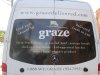
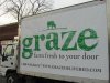
I have a customer that is going to start a business that sells wraps etc. out of a old milk truck. They only want type as their logo. Originally they wanted to use Palatino Bold. Over the past few days I sent them the top two samples here. Yesterday they called and said they have fallen in love with Zapfino. I told them that I wouldn't recommend Zapfino, but I did connect the "a" and "z" and shortened the "g". Anyone have any other ideas?
 

Attachments

  • Screen shot 2012-08-23 at 9.28.55 AM.png
    Screen shot 2012-08-23 at 9.28.55 AM.png
    51.6 KB · Views: 122

Marlene

New Member
I like the middle one too. I'm not a fan of the spaced out letters with dots as it is so 80's but it works with the font you picked. done in some cool colors it could look really nice. maybe a olive green with orange dots or a lime green with olive dots
 

Gino

Premium Subscriber
I presume you mean sandwich wraps and not vehicle wraps........... :omg:


Does the owner have an ethnic appearance he/she would like to show through into this logo ?? Does he/she specialize in any kind of food ??
Yesterday, I met with a guy who has nothing to do with the kinda food he sells, but advertises it as Mediterranean. His accent is not Mediterranean...... :rolleyes:
 

thinksigns

SnowFlake
Yes - sandwich wraps.

It is a group of four women in their mid-40s that want to have this business together. All four of them don't agree on anything. Three of them actually want to put drawings of forks along the bottom to mimic grass, but one battle at a time.

I have attached the logos with the color that they painted the truck.
 

Attachments

  • Screen shot 2012-08-23 at 12.02.02 PM.png
    Screen shot 2012-08-23 at 12.02.02 PM.png
    49.5 KB · Views: 120

Craig Sjoquist

New Member
Of the 3 yes on middle for a enjoyable food image.

Of the one that will sell the women is the bottom.

..I would suggest to fatten it up and ADD a women's face of enjoyment & mouth somehow like a outline only for a icon or added to word .
 

WCSign

New Member
middle one, burnt orange type with a grass green background with a fork and knife "X" on either end of the word
 

visual800

Active Member
I predict 400 layouts, and much interest lost in this job. I could be a fun job if you tighten the reigns now and be firm but polite
 

Gino

Premium Subscriber
You have my deepest sympathy!

I foresee a GIANT headache in your future ... over this job!

I predict 400 layouts, and much interest lost in this job. I could be a fun job if you tighten the reigns now and be firm but polite


1,000% agreement.................... :popcorn:

You're in store for a very long project, before it ever leaves the ground.
 

Pat Whatley

New Member
Eventually the four of them and a couple of bottles of wine will sit down at the computer, find one of the "design you own logo" sites, and they'll put together some atrocity they'll be delighted with. By that point you'll have been beaten into submission and you'll do it just to get them the heck out of your life.
 

thinksigns

SnowFlake
The "leader" of the group is the wife of the customer that gave me my biggest order ever, so they will have a long leash on the project. Plus, even though they probably won't go with my suggestions, it is a fun change of pace from working on commercial real estate signs.

In a brief moment of clarity this morning, I realized they are selling sandwich wraps that you eat with your hands, but they want forks on the truck.
 

Joe Diaz

New Member
I agree with what others have posted. Based on what you've said, this doesn't sound like the ideal set of circumstances. But if things were different, and I believed that you had a good chance of getting through to them, I would try to convince them that simply picking out a font does not make it a logo. Perhaps if you could talk them into allowing you to create custom lettering or script since they only want "type" as their logo.
 

thinksigns

SnowFlake
I finished up their truck this afternoon. I talked them out of Zapfino and the crazy idea of a field of forks along the bottom to mimic grass.

Here are a couple of pics.
 

Attachments

  • graze1.jpg
    graze1.jpg
    330.5 KB · Views: 118
  • graze2.jpg
    graze2.jpg
    331.1 KB · Views: 106

fmg

New Member
Here.
This may give you some inspiration.We did this a couple of years back.:smile:
 

Attachments

  • 48253_438750454916_407364_o.jpg
    48253_438750454916_407364_o.jpg
    59.7 KB · Views: 97
  • 53490_438750374916_4645119_o.jpg
    53490_438750374916_4645119_o.jpg
    52.3 KB · Views: 112
  • 337665_10150452781834284_1101822260_o.jpg
    337665_10150452781834284_1101822260_o.jpg
    69.4 KB · Views: 101
Top