• I want to thank all the members that have upgraded your accounts. I truly appreciate your support of the site monetarily. Supporting the site keeps this site up and running as a lot of work daily goes on behind the scenes. Click to Support Signs101 ...

Logo help please

toucan_graphics

New Member
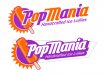
I'm working on a logo for a new client and this is what I have so far. I'm not exactly pleased with what I have so far and so I'm asking for your help and advice. This is the start of a complete brand identity so I really want to get it right. It will also lead to a large amount of work in the next few months as well. The logo should look good on tie dye shirts as well as plain signage like banners etc.

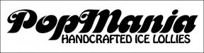
See my progress thus far and please offer input and ideas.

Client wants:
Simple
Retro/vintage
Preferred colors = Orange & Purple or Orange & Chartreuse (Lime green for color simpletons like myself)


pop-mania-logo1.jpg
 

Attachments

  • pop-mania-logo.jpg
    pop-mania-logo.jpg
    21 KB · Views: 119

Pat Whatley

New Member
I actually kind of like the simplicity of what you've got so far...just tighten up that kerning a bit.

Here's a slight variation I tried just to see how it would work.
 

Attachments

  • Untitled-1.jpg
    Untitled-1.jpg
    56.9 KB · Views: 105

CP Signs

New Member
Again, great job on keeping it simple. Only problem I have, and I have to say I am looking at it on my phone so the thumbnail was really small, I thought it was FedEx. Lol. Just the colours. Lol.
 

Jillbeans

New Member
I like the icon but not the fonts. Surely you have some nicer ones somewhere.
Is it retro 70s?
Love....Jill
 

thinksigns

SnowFlake
Maybe show a bite taken out. From the thumbnail it looks like a corndog. Seeing the color of the inside would help with that.
 

laserman70

New Member
Like the icon as well.
the fonts need help.
I would take the icon inner color shadow and use that as the font color with the purple..
seems to go all together with the icon color and wording matching.
just my .02
 

laserman70

New Member
something real quick...
hate the black around the lollie.
tried to incorporate black into by black writing..
I would get rid on outline though
 

Attachments

  • pop-mania-logo1.jpg
    pop-mania-logo1.jpg
    26.7 KB · Views: 101

neato

New Member
I like the idea of the bit taken out.

Here's another retro idea. When I see retro, I reach for my LostType fonts...I changed the pop to purple to avoid the corndog look.
 

Attachments

  • Untitled-1.jpg
    Untitled-1.jpg
    45.4 KB · Views: 117

peavey123

New Member
Try a couple more completely different options. I'm not feeling the "retro-ness".

Here's my 5 min. attempt.
 

Attachments

  • popmania.jpg
    popmania.jpg
    38 KB · Views: 93

Marlene

New Member
I like neato and peavey's ideas. if you stick with yours, do the tilt and look into some other fonts. have you tried it with the purple and lime green? it might also look good
 

Tiki

Font Sage
Keep the word PopMania together maybe try a a shape behind the Popsicle :smile:
 

Attachments

  • 1cc.jpg
    1cc.jpg
    202.9 KB · Views: 108

toucan_graphics

New Member
Excellent ideas and great suggestions! As always, y'all are on point and never fail to impress. Thank you. Now its time to put these ideas together with my clients input and create a few new drafts and see which one the client likes best. I'll post updates here as I go.

BTW Tiki - what font is that in your example?

Thanks again
 
Top