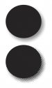
Hey guys, I am playing around with our shop logo because we got a lot of criticism on here about how they are hard to read, I will post up what I've come up with shortly, but I wanted to see if anyone knows how the original designer (prior to my employment here) got the dot pattern around the words? If so that would be a big help.
-
I want to thank all the members that have upgraded your accounts. I truly appreciate your support of the site monetarily. Supporting the site keeps this site up and running as a lot of work daily goes on behind the scenes. Click to Support Signs101 ...
You are using an out of date browser. It may not display this or other websites correctly.
You should upgrade or use an alternative browser.
You should upgrade or use an alternative browser.
Logo Help
- Thread starter modernmav
- Start date

SignManiac
New Member
The van is already wrapped with that logo. What's the point?
J Hill Designs
New Member
Dan Antonelli
New Member
Tough to pull off with that many elements on top of each other. Usually you can tell you might have a legibility issue when you lean too heavily on an outline to pull it off.
Awful lot of noise in the logo; specifically the blue Gulfside, with white outline, then black outline. Visually, that causes a lot of vibrations, and makes it hard to stand out.
Try and break it down to focal points, and order your copy in terms of importance, via primary and seconary. Right now, its a little hard to pull off because your two main elements compete, and somewhat clash.
Usually you know you have a slight problem with a design when it can't be embroidered because of all the details.
ok, I'm just playing around with these for now to see if I can come up with something better to show the owner. Here is the first attempt at the T-Shirts logo, that everyone on here said read as I-shirts. I wanted to keep a similar look as before just make it cleaner and more readable (if thats a word). i posted a before and after for comparison
Attachments


SignManiac
New Member
You're wasting you time trying to salvage that ugly mess. Start from scratch if you're serious about designing a better logo.
")
"Deposit Please"
New Member
I like the one to the right better on your first attempt. Just don't add the dot matrix.


Sign_Boy
New Member
thanks for the input marco. I will have a go from scratch and see what I come up with. I know the owner really likes his original logo (the one on the left) but we'll see if I can come up with something better.
How long have they been using it?
I'd show him a few other logos being used by others... google them. I think he may change his mind then.
Marlene
New Member
they have been using that logo or some close variation of it for the 17yrs i believe
think mullet. there are people still out there with them but they look really bad and outdated. that logo is a mullet, time to update the look and join the rest of us in the new century.
Sign_Boy
New Member
they have been using that logo or some close variation of it for the 17yrs i believe
It's time for a change.