-
I want to thank all the members that have upgraded your accounts. I truly appreciate your support of the site monetarily. Supporting the site keeps this site up and running as a lot of work daily goes on behind the scenes. Click to Support Signs101 ...
You are using an out of date browser. It may not display this or other websites correctly.
You should upgrade or use an alternative browser.
You should upgrade or use an alternative browser.
Logo Help
- Thread starter modernmav
- Start date
SignManiac
New Member
My question is this, has your boss/owner been following this thread. Does he realize his logo is dated and poor to begin with. Is he going to re-wrap the van that was just done with a new logo? Or is this just something you're playing with for your own benefit?
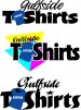
right now its just something i'm playing with. I showed him the old wrap thread with discussion about the logo to see what he thought. This all came up again when one of our customers mentioned something about the logo not being clean and it being hard to read and that really got me thinking more about it. Here is the first attempt at something from scratch, trying to keep it simple and remembering that you guys say design everything in B&W first.
Attachments

Jillbeans
New Member
I don't mind the top of the old T shirt logo, sans effects.
It's the stretched squished icky 80s Mistral looking all-caps script part I really dislike.
Glad you are seeing the light about its being difficult to read.
There are so many attractive casual fonts out there for the T shirts portion of the logo:
California Plug
Roadhouse (peter griffin voice)
No Fishin
Fast Slant
Lumax
etc etc etc
Love....Jill
Flame
New Member
right now its just something i'm playing with. I showed him the old wrap thread with discussion about the logo to see what he thought. This all came up again when one of our customers mentioned something about the logo not being clean and it being hard to read and that really got me thinking more about it. Here is the first attempt at something from scratch, trying to keep it simple and remembering that you guys say design everything in B&W first.
Don't this the wrong way, but at the shop.... you the general worker, install guy or the designer?

Marlene
New Member
the last version posted is pretty bad on all levels. not being mean, just want to help. first off, who are your customer's? that is the first and most important thing to know when designing anything as they are really who you are designing for. if you aren't sure what I mean by that, take a walk thru any mall and look at the signs. If you were looking for a new sweater for your 80 year old grammy, would you go into Pac Sun or Hot Topic?? why not? because the logo told you it wasn't a store that you would find what you needed. look at Christopher Banks in comparison. you might find grammy something in there. again, why? because the logo told you so. everyday, we all respond to the visual messages and we all know what to do and what it means. when you design a logo, your job is to communicate to the customer, not just make something "pretty" or "cool" looking. with that in mind, does your logo tell the customer what it needs to know?
Flame
New Member
designer/printer/installer/production, I do pretty much everything for the sign/wrap portion of the shop
Kinda guessed that. Well, to be blunt I wouldn't hire you for minimum wage as a designer on my shop. The designs you have posted up have been horribly out of the same league of your current logo, and your current logo could REALLY use a new look. With your current grasp of design, you simply aren't going to hit it.
This is where you hire a designer to create a complete identity for your shop, and as the in house designer, thoroughly examine what they produce. I might suggest Dan Antonelli(blows me and most on here away)? He does great work and works with a lot of sign shops. Have him create a logo and identity, give you some guidelines on how to use it, and let 'er roll.
Then if I could offer a suggestion for the future, if you'd like to continue on the path of designing, get some good books. Mastering layout, Antonelli's logo books, or I like Identity Crisis by Jeff Fisher. Then, start breaking down good logo's, layouts you see.... and keep designing. Something fun and good for creativity is in the morning, before you start work. Set yourself a time limit, sit down with a cup of coffee and design a logo for a fictional business. Give yourself a fake job, no boundaries, and create something cool, fun, attractive or sleek for them, but within the time limits. I find it very stimulating!
Then just keep at it and stuff will slowly start turning around and looking better, and better, and better.
My $0.02 for the day.
Last edited:
Jillbeans
New Member
The "T" is still stretched, I think that's what bugs us all the most.
I tried doodling up something for you, I admit that I do not like working in red and blue together.
I thought (I am sure it's been done a million times) maybe of making the T shaped like a T shirt but did not have time.
I think that T shirt should be what stands out most, that's what you are selling.
I'd prefer the custom on the left cuz we read left to right.
Attachments

thanks jill!
-flame, thank you for the suggestions, I will try to pick up as many of those books as possible and look into working with someone like Dan to come up with new stuff.
-marlene, the way you explained it really helps a lot with understanding the importance of a logo. thanks
-flame, thank you for the suggestions, I will try to pick up as many of those books as possible and look into working with someone like Dan to come up with new stuff.
-marlene, the way you explained it really helps a lot with understanding the importance of a logo. thanks
Flame
New Member
thanks jill!
-flame, thank you for the suggestions, I will try to pick up as many of those books as possible and look into working with someone like Dan to come up with new stuff.
-marlene, the way you explained it really helps a lot with understanding the importance of a logo. thanks
I like this guy

lol thanks. I am still very young and new to this side of the industry and want to learn as much as possible to make my career as successful as possible. I appreciate all the help that this forum provides on a daily basis.I like this guy
Marlene
New Member
lol thanks. I am still very young and new to this side of the industry and want to learn as much as possible to make my career as successful as possible. I appreciate all the help that this forum provides on a daily basis.
keep posting your ideas and keep reading all that you can. check out threads posted by Jon Aston. he posts some of the best stuff when it comes to designing. I have a ton of his links in my favorites.