• I want to thank all the members that have upgraded your accounts. I truly appreciate your support of the site monetarily. Supporting the site keeps this site up and running as a lot of work daily goes on behind the scenes. Click to Support Signs101 ...

LOGO help

Sticky Signs

New Member
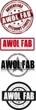
Here's a few concepts we're working on. Nothing is done yet and we're having a hard time deciding which one we like best. I'm hoping you guys can help point us in the right direction.
This company fabricates stuff for the 4x4/off-road market and focuses mainly on Jeeps.
Cheers
 

Attachments

  • Awol favorites.jpg
    Awol favorites.jpg
    50.6 KB · Views: 103

JTBoh

I sell signage and signage accessories.
1st - too distressed, and slanted
2nd - too plain
3rd - not enough contrast
4th - best
 

qmr55

New Member
I'm not too keen on any of them but if I had to choose one it would be the second one without the distressed texture.

Edit: I think the first one could work, why single color though? Get rid of the textured look and play with some colors for contrast and you could have something there
 
J

john1

Guest
I like the 2nd and 4th. Great for print/cut stickers, invoices, business cards etc.
 

WildWestDesigns

Active Member
I'm not too keen on any of them but if I had to choose one it would be the second one without the distressed texture.

Edit: I think the first one could work, why single color though? Get rid of the textured look and play with some colors for contrast and you could have something there

If you approach it from putting this on shirts, the first one, because of the weathered look. That's the fad right now is the weathered "grunge" look.

I know that this type of look sells pretty well to the a/m performance vehicle crowd as well, which seems like would be that companies target audience as well (jeeps).

I don't think the weathered look would go well with other items though, so that effect would have to be taken out on some things unless the layout was done around that, so that way it would still show up.
 

Craig Sjoquist

New Member
Idon't know just does not look off road, Jeep or 4x4 to me.

They are nice but not for a Jeep or off road look..Needs more sport & brawn & GRRRRR in them.
 

JoshLoring

New Member
Break the roundness out the 4th one and use a meaty tire tread side view ;) bring the vehicle into the logo without bring the vehicle.
 

visual800

Active Member
I like number 3 with the star. i suppose you can alter its appearance by taking out transparencies if need to
 

John in Cali

New Member
My preference is number one, with some tweaking...maybe back off a bit with the "grunge".

I just noticed the stars on the top do not match the bottom stars. Match the top to the bottom.
 

Attachments

  • awol.jpg
    awol.jpg
    752.2 KB · Views: 79

JTBoh

I sell signage and signage accessories.
on number 1, maybe take out the distressed look, make the crossbar a rough wood texture, same color, with a broken stick look at the ends, trapazoidal shaped. Would enhance the outdoor part, but everything else would have to be clean lines to counter the use of a texture.
 
Top