• I want to thank all the members that have upgraded your accounts. I truly appreciate your support of the site monetarily. Supporting the site keeps this site up and running as a lot of work daily goes on behind the scenes. Click to Support Signs101 ...

Logo Re-design

showcase 66

New Member
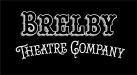
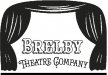
My brother and sis in law have a theatre company that they started when they were in college. One of their buddies at the time did a logo for them. I hated it but they seemed to like it at the time. about 4 years ago. This past weekend I talked them into doing something different than what they had. They wanted the logo to look like a stage and the curtains to be the letter "B". I came up with a (to me) more modern feel for what they originally had.

Here is a pic of the original on top and my version on the bottom. They wanted 2-3 colors but I think something like this is better just one color.

Any input is appreciated,

Thanks
BJ
 

Attachments

  • Brelby Compare.jpg
    Brelby Compare.jpg
    52.5 KB · Views: 295
Last edited:

SignManiac

New Member
I have to be honest, the one on top is better. If they were to agree to a new logo, I would start over entirely with a new direction. Neither one reads Brelby at all
 

WrapperX

New Member
Using the stage to spell the name is clever but doesn't really work for either. Although between the two I prefer the bottom one.

BUT I would follow Maniac advice and start over. A whole new look and direction would be beneficial.
 

Locals Find!

New Member
The top one is better looking. The bottom one was totally off. Just didn't work at all. I see what you were trying to do but, take a break & start over like has already been suggested.
 

Jillbeans

New Member
I agree, neither one is cohesive as a name.
I would do them a favor and come up with something great.
I'd go in the retro direction, like an old theater marquee.
Some of them were really amazing.
Even the old masks of comedy/tragedy would get people thinking of a theater.
Love....Jill
 

Pat Whatley

New Member
Neither one really works. You did what you could with their B=curtains idea but the idea is bad....there's nowhere you can really go with it.
 

showcase 66

New Member
Thanks for the input. The main thing that they wanted was the curtains as "B"s. After looking at it again after reading the comments, I can see better what you have said. They dont want anything to do with the comedy/tragedy masks. They said that 1 out of every 4 theatre's have them in the logo and they dont want to look like others

I like jill's idea about the marquee. One problem is going to get my sis in law on that thought. She does not like retro looking things.

I already sent my brother the layout I had. Wishing I hadn't. Oh well.

Will probably have something else up later

Thanks again
 

Joe Diaz

New Member
Being cute with images in the place of letters rarely works, and in the extremely rare chance that it does, It will only work because you can still clearly read the name of the business. In both of these cases it takes quite a while to read what it actually says. The redesign actually takes longer. You don't want that. You don't want people to have to struggle to figure out what the message is... that would make it a failed logo in my book.

Try something new, and separate the imagery from the copy and you will be on the right track.
 

fmg

New Member
Looking to incorporate the word of the company into the stage looks just awful and does not work a single ounce.Top reads RELY and bottom read ELY
Concentrate on a much better font and why not have one stage curtain on one side of the word kind of opening to reveal the tag.Just a two cents opinion that's all!
 

SlightlyChilled

New Member
Is there a way to use a can light or something that people that are not in the bizz still might know?

I see something like this in my head this is just a doodle.... not any where the end idea just a start
 

Attachments

  • aaaaaaaaaaaaaaaaaaaaaaaaaaaaaaaaaaa.jpg
    aaaaaaaaaaaaaaaaaaaaaaaaaaaaaaaaaaa.jpg
    42.1 KB · Views: 255
Last edited:

signage

New Member
I do not think the cutains work for the B's.
How about something like this?
 

Attachments

  • Brelb Compare.jpg
    Brelb Compare.jpg
    150.5 KB · Views: 257

signmeup

New Member
Your elements re-worked so the initials are a little featured performer on the stage.
(hate the Y in that font... it's too small)
 

Attachments

  • BTC.jpg
    BTC.jpg
    32.1 KB · Views: 224

Jillbeans

New Member
Or this.
(I really hate Hobo, used to use it for hand-painted garden center signs)
I used Flashscript and a Becker font.
 

Attachments

  • Graphic1.jpg
    Graphic1.jpg
    52.2 KB · Views: 259

Marlene

New Member
Being cute with images in the place of letters rarely works

you can keep the "B" shaped curtains but just don't make them part of the name that way if people see "B's", cool, but if not, you don't force people to try to read something that is just to hard to read.
 
Top