• I want to thank all the members that have upgraded your accounts. I truly appreciate your support of the site monetarily. Supporting the site keeps this site up and running as a lot of work daily goes on behind the scenes. Click to Support Signs101 ...

Looking for thoughts on locksmith van design

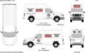
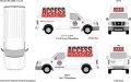
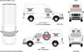
I have always gotten great advice from the members on here so I figured I would post this design for critique. I do a lot of fire truck work and a little bit of heavy truck lettering, so vans aren't exactly my normal canvas. The logo on the front doors is not my design, but must be included. I pulled the "Access Locksmith" text out of the logo to put on the sliding side doors because it is just too small when left intact. All of the other lettering is required to be on the van somewhere, so deleting certain things is not an option. I wanted to keep it clean and readable. Let me know what you think!

attachment.php
 

Attachments

  • ACCESS LOCKSMITH.jpg
    ACCESS LOCKSMITH.jpg
    53.2 KB · Views: 909

Gino

Premium Subscriber
The main objection is..... I can't read 'locksmith' anywhere. I think you need to tear some things apart and place them and give them some value as to what comes first, second and so on. You also need flow. Your composition seems to be broken up sorta wrong. The sides and rear need a lotta work, yet. Good start, though.
 

nikdoobs

New Member
I'd make that logo as big as possible and get rid of all the residential/commercial jargon that doesn't accomplish much of anything except take up space.


attachment.php
 

Attachments

  • attachment-1 copy.jpg
    attachment-1 copy.jpg
    141.2 KB · Views: 222
I'd make that logo as big as possible and get rid of all the residential/commercial jargon that doesn't accomplish much of anything except take up space.


attachment.php

Much better I was wondering why you have a high top van but not using any of the space. Personally I would switch the doors and the big logo.
 
After looking at it again I do agree that I need to find a way to emphasize "locksmith". As far as the big logo covering the whole side, the customer wants something clean and not too crazy, so I don't know if they would go for that. They also asked me to make sure the logo was on the sliding door on both sides so that when the door is open it is still easily readable.
 

nikdoobs

New Member
people are ******* stupid. I guess the 10 seconds when the door is open is extremely crucial. "Let's make the logo super small so it's hard to read all the time instead of making it easy to read 99.999% of the time.
 
people are ******* stupid. I guess the 10 seconds when the door is open is extremely crucial. "Let's make the logo super small so it's hard to read all the time instead of making it easy to read 99.999% of the time.

My guess is they do a lot of repairs out of the van. So the van is parked on site with the door open usually the whole time the guy is working. If someone drives by they wouldn't be able to tell what it is.
 
My guess is they do a lot of repairs out of the van. So the van is parked on site with the door open usually the whole time the guy is working. If someone drives by they wouldn't be able to tell what it is.

You are exactly right. The doors stay open most of the day at each job. His current van wasn't designed with this in mind, you cannot read the company name with the doors open.
 
You are exactly right. The doors stay open most of the day at each job. His current van wasn't designed with this in mind, you cannot read the company name with the doors open.

What if you just did the lock logo big on the middle slider door and then tie in all the other services on the back section of the sides. That way together everything ties in nicely but when he opens the door all you will see is the big lock logo.
 

Gino

Premium Subscriber
You are exactly right. The doors stay open most of the day at each job. His current van wasn't designed with this in mind, you cannot read the company name with the doors open.


That's easy enough. Make the truck look correct and sell him a small job sign to place on the property where he's working and remember to take it with him to the next job.

There is no sense behind ruining a perfectly good size truck with a dinky little logo. That would not be a good sign person, if you let them dictate to you such a trivial point as becoming a main thought.

I think you can get it big enough on that one door that it won't matter. Especially if you fill that back area with the services. If you force him to do something he doesn't want he is either going to not order it. Or not come back or both.

My thought on it. This is what I would offer him. Obviously I don't have access to the files.
 

Attachments

  • Untitled.jpg
    Untitled.jpg
    47.3 KB · Views: 205

Gino

Premium Subscriber
I think you can get it big enough on that one door that it won't matter. Especially if you fill that back area with the services. If you force him to do something he doesn't want he is either going to not order it. Or not come back or both.

My thought on it. This is what I would offer him. Obviously I don't have access to the files.


Yeah, you're right. With a computer today, anyone can fill 10lbs of crap into a 5lb bag. No offense, but that mess looks worse than his original size. You don't don't jam things here and there to please a customer. Who in their right mind is gonna say, now that looks good and look how he got all that sh!t crammed on there.

You wanna please your customer at a job site, so put a sign out, put a flag out, but while he's driving around to the next job or to the warehouse for supplies.... whose gonna be able to read the little stuff he first had.... or your forced overloaded example ?? Yours has sensory overload with everything hitting at one time. If you can't force it in there with out it looking forced or squished..... it's no good.

Throw the computer out and just make a quick sketch of this and you can instantly see it most probably won't work that way. :rock-n-roll:
 
Yeah, you're right. With a computer today, anyone can fill 10lbs of crap into a 5lb bag. No offense, but that mess looks worse than his original size. You don't don't jam things here and there to please a customer. Who in their right mind is gonna say, now that looks good and look how he got all that sh!t crammed on there. You wanna please your customer at a job site, so put a sign out, put a flag out, but while he's driving around to the next job or to the warehouse for supplies.... whose gonna be able to read the little stuff he first had.... or your forced overloaded example ?? Yours has sensory overload with everything hitting at one time. If you can't force it in there with out it looking forced or squished..... it's no good. Throw the computer out and just make a quick sketch of this and you can instantly see it most probably won't work that way. :rock-n-roll:


There are definitely a lot of great suggestions here for me to think about. I am going to think on it and see what I can come up with. I wish I could start from scratch, but that logo has to be used. The other thing that I can't quite wrap my mind around is the whole making it bigger concept in relation to this particular vehicle. These Nissan vans have very deep, pronounced depressions where the windows would be if it wasn't a panel van. It seems to me like splitting the graphics over these seams would look like the design wasn't well thought out, because they will have to be trimmed at the seams.
 

TimToad

Active Member
My take on one of the challenges you face is that anytime I see duplications of a logo or variation of the same logo on the same plane, I ignore them both if they are too close to the same size. One needs to be way smaller to allow the dominant one to take priority and lead the way.

The bullet points of service is another issue we all have to deal with. If we all refused to work with insistent customers who didn't throw themselves at our design feet, none of us would have many customers.

The diplomatic, supportive steering of our customers towards good design is as important as anything we do for them, but its also the most risky.

I do my utmost to downplay services offered bullet points, but the majority of service related contractors see them as being as important as the main message. Education is all well and good, but in the end, there are just too many of us who will do whatever the customer wants whether its effective or not.

I'd have to say that one of my most effective educational tools is the simple statement that the average viewer has between 2 and 5 seconds to read, comprehend and retain any advertising message they see while on the street.

i really like Gino's idea of selling him on the most effective design for the van for all purposes AND a stand alone sign for when he's parked at a job site.
 
Two revisions. One still incorporates everything the customer asked for, the other is a more simplified and cleaner version. Both still work around the contours of the body so that there won't be a problem if the customer decides to go with reflective. He was very insistent on making sure the logo fit exactly on the sliding door, so I am not sure how he will react to these designs. But I will give it a try and see what happens.

attachment.php
 

Attachments

  • ACCESS LOCKSMITH 3.jpg
    ACCESS LOCKSMITH 3.jpg
    83.6 KB · Views: 290

Gino

Premium Subscriber
Vast improvement. Now you can clearly read it, wherever he is. If one side can't be read, while parked with the door open just tell him for the sake of traveling, just to use a small site sign.

Here is what I tell people, somewhat like toadman..... your vehicle while traveling on any given day, will see anywhere upwards of 10,000 to 20,000 people a day. While it's stopped at a red light or people standing at a bus stop, you will probably have a better chance of viewers with this layout then a few people walking by a small layout on a single door Parked in someone's driveway for an hour or two.

Say this with authority and like you know it.... and they will say........ well, it sounds like you know what you're talking about.

Then, sell them the site sign for a discounted price and you made a friend and great customer.
 

player

New Member
You could load him up with 50 24" x 32" corro signs and some stakes. He sets them up at job sites and leaves them there for a few days or a week. If he loses a few here and there, cheap advertising.
 

rjssigns

Active Member
You could load him up with 50 24" x 32" corro signs and some stakes. He sets them up at job sites and leaves them there for a few days or a week. If he loses a few here and there, cheap advertising.

This^^^

We used to do 600 at a time(screened head-to-head on coated poster stock) for a home improvement contractor. Used a simple wire "U" stake. Would get a good 6 mos. out of them.
 
Just an update to this thread... I finished the job the other day. The customer ended up agreeing to let me go with the big logo on the sides, but the compromise was he still wanted the bullet points. It was printed by a local 3M certified shop on Ij180cv3 with 8518 laminate.

I learned quite a few things while doing this job. 1- There are no straight lines on these vans except for the very bottom 2- A laser level is a must have 3- Putting all of these graphics on in a driveway in 90-100 degree heat is not fun and 4- It is physically impossible to get to the big area over the windshield without a helicopter.

But all things considered the job went well. I will be going back to put the logo over the windshield as soon as we can figure out how to safely get to that area. Thank you all for the help, I couldn't have done it without Signs101!

attachment.php
attachment.php
 

Attachments

  • access.jpg
    access.jpg
    94.7 KB · Views: 491
  • access 2.jpg
    access 2.jpg
    90 KB · Views: 281
Top