-
I want to thank all the members that have upgraded your accounts. I truly appreciate your support of the site monetarily. Supporting the site keeps this site up and running as a lot of work daily goes on behind the scenes. Click to Support Signs101 ...
You are using an out of date browser. It may not display this or other websites correctly.
You should upgrade or use an alternative browser.
You should upgrade or use an alternative browser.
Looks easy...
- Thread starter shoresigns
- Start date

Fred Weiss
Merchant Member
Helvetica Compressed
graphixplus
New Member
kerning
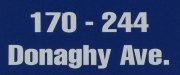
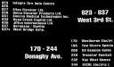
This font always needs to be kerned (if thats a word). especially with omega! Abused is a good word.
This font always needs to be kerned (if thats a word). especially with omega! Abused is a good word.
shoresigns
New Member
Yup, does anyone in this industry look at their kerning when doing numbers? It is the most widely abused area of typography.
I think I'm on your side, but that might be slightly debatable when it comes to tabular vs. proportional. Tabular does often look a little better when you have columns of 3-digit suite numbers.
Also, thanks Fred!
Jester1167
Premium Subscriber
Fred Weiss
Merchant Member
That's on my list also but I would rather name it as what it has been for at least the 32 years I've been using it.
bob
It's better to have two hands than one glove.
Yup, does anyone in this industry look at their kerning when doing numbers? It is the most widely abused area of typography.
In most non-specimen type faces numbers are mono-spaced. And rightly so for reasons that should be obvious to the most casual observer.
David Wright
New Member
Swiss 911 compressed