Joe Diaz
New Member
:Big Laugh Anyway, this isn't about threads closing, however I had a nice long reply typed up, because I was going to be nice and help someone out with their use of Red and Black in their design.
So Let's not dig up that, but instead let's talk about using Red and Black together in design.... again. Perhaps that person that was struggling might find this helpful.

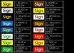
It's all about contrast, boundaries and space. Do the squint test (squint your eyes while looking at your design) to see what reads the best. Since you don't get much higher contrast than back and white, the Black outline or contour that some signmakers put around Red lettering actually acts as the boundaries of the letters itself. Mistakenly people add these outlines/contours in an attempt to create visual appeal or in an attempt to make that lettering stand out, but what it actually does is make the letters look too fat. Take the top "normal" and the "worst" for example. In those examples, the center white areas of the "A", "R"s and the spaces on the "S" in addition to the spaces between the letters are swallowed up by the Black border, making that text extremely hard to read. The space between those letters are almost as important as the letters themselves.
I think some novice designers also mistakenly think Red is a bright color so they assume Red and Black have enough contrast, however if you were to take a design with Red in it down to grayscale, that Red would appear as a medium to dark gray. So just be mindful of contrast and negative space.
So Let's not dig up that, but instead let's talk about using Red and Black together in design.... again. Perhaps that person that was struggling might find this helpful.
It's all about contrast, boundaries and space. Do the squint test (squint your eyes while looking at your design) to see what reads the best. Since you don't get much higher contrast than back and white, the Black outline or contour that some signmakers put around Red lettering actually acts as the boundaries of the letters itself. Mistakenly people add these outlines/contours in an attempt to create visual appeal or in an attempt to make that lettering stand out, but what it actually does is make the letters look too fat. Take the top "normal" and the "worst" for example. In those examples, the center white areas of the "A", "R"s and the spaces on the "S" in addition to the spaces between the letters are swallowed up by the Black border, making that text extremely hard to read. The space between those letters are almost as important as the letters themselves.
I think some novice designers also mistakenly think Red is a bright color so they assume Red and Black have enough contrast, however if you were to take a design with Red in it down to grayscale, that Red would appear as a medium to dark gray. So just be mindful of contrast and negative space.
Last edited:

")
 Joe
Joe