-
I want to thank all the members that have upgraded your accounts. I truly appreciate your support of the site monetarily. Supporting the site keeps this site up and running as a lot of work daily goes on behind the scenes. Click to Support Signs101 ...
You are using an out of date browser. It may not display this or other websites correctly.
You should upgrade or use an alternative browser.
You should upgrade or use an alternative browser.
'mascot' logo
- Thread starter TyrantDesigner
- Start date
Jillbeans
New Member
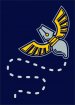
I think it looks backwards. I realize that the dotted lines are supposed to convey motion, but knowing that the nib is where a line comes from when using an ink pen, this looks like the end of the pen is making a choppy line (something that really sucks when you are using a real ink pen)
If that makes any sense.
The illustration is fine but I am not in love with the dotted line.
Love....Jill
PS
Maybe if you flipped the wings it would look less backwards.
If that makes any sense.
The illustration is fine but I am not in love with the dotted line.
Love....Jill
PS
Maybe if you flipped the wings it would look less backwards.
TyrantDesigner
Art! Hot and fresh.
I dislike the dotted lines too. I thought it could do without it, but customer wants it, I can live with it. I thought the original idea of a pen/bug thing like an egyptian scarab pendant was cooler than a buzzing bug post thought.
HulkSmash
New Member
I dislike the dotted lines too. I thought it could do without it, but customer wants it, I can live with it. I thought the original idea of a pen/bug thing like an egyptian scarab pendant was cooler than a buzzing bug post thought.
I think the blue lines or "shadows" Make it look cheap. Maybe there's a different way you can portray that.
WildWestDesigns
Active Member
I always look at these things from an embroidery point of view. We like simplicity. Why? At some point someone is going to want this as a left breast logo. Complicated stuff with 1/32 inch lettering sux.
From that standpoint it looks ok.
I'm in the same boat as binki when it comes to looking at everything from an embroidery stand point ("simplicity" just depends on the pattern and what is needing to be done within the given design) .
However, that double contour outline is going to be an issue. Particularly the outer one as it is smaller. Sizing at 3.5" (typical logo crest size, although anything up to 4" would work, but 4" can be pretty big depending on the pattern), that outer contour is coming at .02" width. Some machines (not all) will struggle with that trying to do a satin stitch, even with slowing the machine down, putting in a smaller needle and lighter weight thread. Depending on what fabric you are putting it on, might not turn out so well (due to push/pull of the fabric as it interacts with the needle and thread). Make that outer one a running stitch (or bean stitch, stem stitch etc) and it just doesn't look good against the first satin outline, but it would be more appropriate for the size (width) of that outer contour outline.
I tend to advocate against double contours (or more) for that very reason (although I do have other reasons why I'm not too fond of them in embroidery).
The detail definition work can also be an issue with it's close proximity to the first outline, but you do have a couple of options with it, one of which most don't think about doing, but one that I like to use.
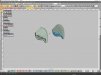
I don't know how well it would convey size of everything uploading here, but I did include a screenshot of the picture in my program sized at 100%. My program is calibrated to that particular monitor, so that is 1:1. The rectangle itself is 4" tall, but the design is ~3.5" tall (I think 3.48", close enough)
I know you said it was designed for 2 color screenprint and graphics, but (like binki said) typically sooner or later they get to embroidery, if not for shirts, then for hats (that would open up a whole other can of worms, size may or may not be the issue, depends on the style of hat and the machine being used).
Attachments
John Butto
New Member
4th installment
new transformer in #4I don't get it. What are you trying to portray. The dotted lines are bad.

TyrantDesigner
Art! Hot and fresh.
Can't change the line, final approval. If we revise it later, I can suggest it as I did when they first wanted a movement line .. but probably won't happen.
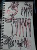
As for the 'fluffy' thing ... my original sketches for the client was an almost like a dragonfly but that route was instantly rejected because that would make it too 'scary' so wanted to go more round bug style ... that fluffy part is the handle on older style pen nib holders. if a long stem came out of it, that rounded part would sit on the fleshy part of your hand between the thumb and fore finger and the metal part that holds a nib is what you would grip with your finger tips.
So when the idea of what would be easily recognizable was turned down (you can see my research on calligraphy pens attached) ... decided to go more beetle / bee like, dropped the more movement based pose and designed more for a more rigid design ... as such, the handle became shorter and fatter and less long handle like.
Attachments
TyrantDesigner
Art! Hot and fresh.
Yeah, we would actually sew the blue in the design.
why would you sew the blue in the design? If that would be the case, the double outline to give the illusion of a third color would not be needed and could be replaced with say ... black and would be almost 3d with embroidery and wouldn't also need the 'shadow' lines correct?
edit - and also, would something like this be more like a raised stitch or a flat stitch style? (I think I got that right ... think)
I'm not to experienced with embroidery design ... most i've seen one of my customers embroider something of mine has been monograms and simple logos (geometric stuff really)
ProWraps
New Member
that fluffy part is the handle on older style pen nib holders. if a long stem came out of it, that rounded part would sit on the fleshy part of your hand between the thumb and fore finger and the metal part that holds a nib is what you would grip with your finger tips.
So when the idea of what would be easily recognizable was turned down (you can see my research on calligraphy pens attached) ... decided to go more beetle / bee like, dropped the more movement based pose and designed more for a more rigid design ... as such, the handle became shorter and fatter and less long handle like.
is someone going to explain all that to everyone that looks at this thing?
TyrantDesigner
Art! Hot and fresh.
is someone going to explain all that to everyone that looks at this thing?
no, I expect that if you are going to a company that does custom calligraphy ... you know what a pen nib goes into. ... but really these days I'm shocked when people know what a rotary phone looks like.
edit- sorry, that was snarky ... but if you have any suggestions on how to get a long handled pen nib holder to look more bug like without being long and still look 100% like a pen nib holder ... I would love to get suggestions for the future.
Marlene
New Member
the dragonfly was pretty and looked nice and was easy to figure out. too bad they never listen as it could have been classy looking and less kid looking. only and if only are they standing in the shop when they wee this will most figure out what they are looking at and that's too bad as it could have been nice. nice job with what you had to work with and I applaud your research
SignManiac
New Member
Until I read what it was for, I had no idea what it was or what it was supposed to be. I love it when clients know better than us what is best for them. They get what they deserve. Oh, and I remember using calligraphy pens a long time ago. Of course I'm not too bright.
WildWestDesigns
Active Member
edit - and also, would something like this be more like a raised stitch or a flat stitch style? (I think I got that right ... think)
It really just depends on how things are done. Particularly the blue detail lines on the wings, nib etc. If those are done in satin stitching (raised stitch), typically the bottom layer is a fill stitching(flat stitch).
If you use extra needle penetrations on the satin top stitch (left version), you can get away with just using a satin stitch (plus it helps keep stitch length down (all machines have a max. width that they can do with a satin stitch before the head starts making an awful noise and it gets out of "time", in which case you need to use a fill stitch).