-
I want to thank all the members that have upgraded your accounts. I truly appreciate your support of the site monetarily. Supporting the site keeps this site up and running as a lot of work daily goes on behind the scenes. Click to Support Signs101 ...
You are using an out of date browser. It may not display this or other websites correctly.
You should upgrade or use an alternative browser.
You should upgrade or use an alternative browser.
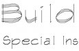
match requested for an ugly font
- Thread starter iSign
- Start date
Replicator
New Member
Wow! . . . Where the hell did that come from ?
SignosaurusRex
Active Member
Rep, I know you have that one....I've seen it in your library! Come'on, cough up the name! ...lol...LOL...LOL
Craig Sjoquist
New Member
thats one fugly font lol
looks like used for engraving
bet it looks cool then
font fugly
looks like used for engraving
bet it looks cool then
font fugly
vid
New Member
Match for that font?...
Dude, you need a propane torch for that font!
I'd think Craig hit it with the engraved idea. Looks as though it has some characteristics of a technical or tekton, though. Try giving it some fatty outlines on the strokes to see if it becomes more recognizable.
Good Luck
Dude, you need a propane torch for that font!
I'd think Craig hit it with the engraved idea. Looks as though it has some characteristics of a technical or tekton, though. Try giving it some fatty outlines on the strokes to see if it becomes more recognizable.
Good Luck

Idea Design
New Member
I think Tiki's got it.
The reason that font file appears that way is AutoCAD uses color dependant plot styles, by that I mean that a specific color is tied to a specific linewieght when you send a line plot out.
That font would fill itself out based on the lineweight at which it was printed inside cad.
The reason that font file appears that way is AutoCAD uses color dependant plot styles, by that I mean that a specific color is tied to a specific linewieght when you send a line plot out.
That font would fill itself out based on the lineweight at which it was printed inside cad.
iSign
New Member
Tiki, thank you for that. I think that has potential to satisfy the client, improve the layout at least a little, and allow me some other production methods besides digital printing.
Si,
agreed... it is that ugly..
but, this client brought me into a $20,000.00 job five years ago! ...so firing him is out of the question. :Big Laugh
He is a successfull Architect who has a draftsman sharing office space. They don't need a sign, but desided to put a small one near the door, for folks who have already found them. The Architects name will be set in Castellar, but his draftsman chose this ther horrorshow for his own name added to the sign.
Although "firing" is off the table, I've already made several minor changes to his original request in the 10 minutes we spent getting his requests written up & his deposit in my hand yesterday. I was in holiday mode, so I did not yet work the ambitious upsell I think I am capable of, & he deserves. I will propose an improved layout & I will also quote him 2 dimensional alternatives above the bang out 2 color flat sign he came in asking for.
Here is just one shot from a recent acomplishment of this clients:

That is so ug-leee that I would fire that customer!

Si,
agreed... it is that ugly..
but, this client brought me into a $20,000.00 job five years ago!
...so firing him is out of the question. :Big LaughHe is a successfull Architect who has a draftsman sharing office space. They don't need a sign, but desided to put a small one near the door, for folks who have already found them. The Architects name will be set in Castellar, but his draftsman chose this ther horrorshow for his own name added to the sign.
Although "firing" is off the table, I've already made several minor changes to his original request in the 10 minutes we spent getting his requests written up & his deposit in my hand yesterday. I was in holiday mode, so I did not yet work the ambitious upsell I think I am capable of, & he deserves. I will propose an improved layout & I will also quote him 2 dimensional alternatives above the bang out 2 color flat sign he came in asking for.
Here is just one shot from a recent acomplishment of this clients:
iSign
New Member
Tiki,
I ran a search for Architext at myfonts.com & came up with a much nicer font, but it is an all caps font. Can you give me a link to the one you found?
I also found another nice draftsman looking font I could have used last week:
http://www.myfonts.com/fonts/fonthead/two-by-four/regular/
I actually scanned some light lettering guidelines to add to some copy set in tekton. It came out nice, but this two by four font would have been nicer.
SignosaurusRex
Active Member
Isign, How much latitude do have for font choice? How about Graphite Light? Very nice architectural font! or Enviro...or Tekton....or ITC Stylus.....Just a thought