-
I want to thank all the members that have upgraded your accounts. I truly appreciate your support of the site monetarily. Supporting the site keeps this site up and running as a lot of work daily goes on behind the scenes. Click to Support Signs101 ...
You are using an out of date browser. It may not display this or other websites correctly.
You should upgrade or use an alternative browser.
You should upgrade or use an alternative browser.
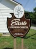
MDO Church Sign
- Thread starter Deaton Design
- Start date

SignManiac
New Member
Another winner there John! Love the shape. I haven't seen anything like that before, very original.
Craig Sjoquist
New Member
Deaton Design
New Member
Great as always.
What's the purpose of those two little lags at the bottom ??
To hang a small sign that says "Revival in Progress" when they have one.

Gino
Premium Subscriber
Haha......... I was hoping you had a reason and just didn't forget to take your guides away..... 
Like everyone said... it's great !! Your stuff is quickly recognizable with the font choice, styling of characters and uniformed well-thought out themes you create. Your colors are always spectacular and the flow is just heavenly [no pun here], but it fits......... 
Like everyone said... it's great !! Your stuff is quickly recognizable with the font choice
Just more kudos........ :U Rock:
vid
New Member
I was thinking the same thing as Gino about the colors being spot on and legible --- they work great to prioritize the copy.
hmmmmmmm... sounds like that might be a topic for a Church Sermon. LOL
Easy digging, but it was still too dang hot! ...
hmmmmmmm... sounds like that might be a topic for a Church Sermon. LOL