-
I want to thank all the members that have upgraded your accounts. I truly appreciate your support of the site monetarily. Supporting the site keeps this site up and running as a lot of work daily goes on behind the scenes. Click to Support Signs101 ...
You are using an out of date browser. It may not display this or other websites correctly.
You should upgrade or use an alternative browser.
You should upgrade or use an alternative browser.
More Concession trailers!
- Thread starter ucmj22
- Start date
Typestries
New Member
ucmj22
New Member
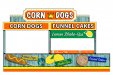
I like it. I'm sure there is a reason, but the lower awning panel repeats the upper sign panel. With space a commodity on the midway, would it be worth putting something else in the awning panel rather than be repetitive?
funny you mention. they just said they wanted to change it (all signs read as customer specified). they now want both flip ups on the side to read funnel cakes and the flip ups on the end to read Corn Dogs. there are also 4 corner flipups that will read Lemon Shakeup. since that is all they sell in this trailer, its hard not to be repetitive.
ucmj22
New Member
i like it.. im also glad you didnt put "Real" food on it like most idiots do
that was originally what they wanted, but I created the cartoon Items and they liked it with the beachy, boardwalk theme/colors (Thank God). just finished a real food trailer today too, the italian sausage looked like a turd on a bun.
Craig Sjoquist
New Member
1st 2 things I noticed is the picture of a corndog the word corndogs is hard to read brown or white might be a better color.
The 2nd thing which you might not have a choice on is the main top panel corn dogs casual font looks boring and cheap (not cost wise )
But do like the start looks fairly good and interesting.
The 2nd thing which you might not have a choice on is the main top panel corn dogs casual font looks boring and cheap (not cost wise )
But do like the start looks fairly good and interesting.

ucmj22
New Member
Basically. They throw a bunch of sugar and ice in a cup then fill it wit squeezed lemons and water, put another cup on top and shake it till the wheels fall off.Looks pretty good, but I gotta ask, what's a lemon shake-up? Is that carni speak for lemonade?
Funny you mention. My original had no wood, they requested the wood background.loose the wood effect.....to distracting. carnies like it BOLD, SIMPLE, EASY TO READ ...fast!!!!! your selling their products not you ability to make backgrounds))))
All the fonts have been changed adnauseum regergatatum, and this is what passed the carni test I do agree on the funnel cake lettering, I don't want to ad a new color since there is so many already. Maybe draw the black...1st 2 things I noticed is the picture of a corndog the word corndogs is hard to read brown or white might be a better color.
The 2nd thing which you might not have a choice on is the main top panel corn dogs casual font looks boring and cheap (not cost wise )
But do like the start looks fairly good and interesting.
Shift Designs
New Member
the italian sausage looked like a turd on a bun.
lmao
Locals Find!
New Member
Basically. They throw a bunch of sugar and ice in a cup then fill it wit squeezed lemons and water, put another cup on top and shake it till the wheels fall off.
So, its carni speak for lemonade thats shaken instead of stirred LOL. You need a little James Bond on their ordering one. -J/K
petesign
New Member
I actually like the wood. Shows that they don't take themselves too seriously. As for the duplicate message... If they only sell three things - and there's a crowd around - you wont be able to read the bottom anyway. If there isn't a crowd, I don't guess it's a bad thing to get your message across in more than one spot.