• I want to thank all the members that have upgraded your accounts. I truly appreciate your support of the site monetarily. Supporting the site keeps this site up and running as a lot of work daily goes on behind the scenes. Click to Support Signs101 ...

My attempts at Vehicle half wraps

Stevealex

New Member
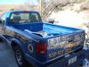
Hello all, this will be my second post on signs101 and I must say, I was broken in pretty good on that first post but after consideration it was a necessary evil and im ready to get saddled up and take another dose of brutal honesty. Okay so the blue truck is mine and it was mostly done but as you can see its not completed on one side at the time of this pic. By the way im reconsidering redoing my logo because of the lack of readability especialy from a distance. Any opinions on the effect that changing my logo this early in the game (3.5 mos) will have on my business?

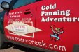
As for the green suv, the customer was adamant about me designing his wrap to look just like his website, Plus he wants it done in sections. it will eventually be a full wrap. I know the fonts and layout arent up to par yet but in my defense I am now reading mike steven's mastering layout (Awsome btw) and I just bought fonts from Steve with signFonts.com.:rock-n-roll:
 

Attachments

  • DSC04677.jpg
    DSC04677.jpg
    88.1 KB · Views: 105
  • DSC_0045.JPG
    DSC_0045.JPG
    475.6 KB · Views: 89
  • DSC_0050.JPG
    DSC_0050.JPG
    293.7 KB · Views: 86

Rick

Certified Enneadecagon Designer
Change the logo.. hopefully for the better. Keeping a poor logo could never be good for business and I highly doubt there is enough "brand equity" to slow your business growth. in fact improving the logo will probably help.

On your vehicle, poor use of display type... and please, no Papyrus... no really, lose the Papyrus. Think of display type and salt, you season your layout with it, not pour the whole thing into it. Can't see the truck good enough to know if that pattern is working.

The red on green is a very bad choice, it makes the vehicle like a TJ Taxi...

On both layouts, your tracking (overall spaces between the letters) is all over the place, be careful with loose tracking (letters spread apart) and tight tracking (too close)
 

Rick

Certified Enneadecagon Designer
Oh and I forgot... lose the Comic Sans too... next to brush Script, it's the joke typeface of all time... and that red phone number with the white outline is not very legible. the prospector guy is a little rough

http://bancomicsans.com/main/
 

Stevealex

New Member
Lol ya I agree. Ive heard that alot about the comic sans and brush script since ive been looking around on this forum. Ill delete them both from my fonts. Also that prospector guy was some cheap raster clipart he sent me and I just vectorized and worked with a little. He wanted that on there because of his website i guess. So far the green and red are pretty ugly together but eventually it will b fully wrapped with no green cause he cant afford the whole thing at once.
 

weaselboogie

New Member
The blue truck isn't bad, a bit cluttery, but I would denounce the green and red thing from your portfolio. Poor choice to wrap it only on the doors using completely different color. It looks like it was hit from the side and these are the replacement doors from the junkyard. If the customer wanted it to look like his website with the red, I would have suggested lettering only or talk him into a full wrap.
 

fmg

New Member
Don't want to sound harsh but what's up or down in this case with the phone number? It appears it's taking a slant downwards to the right. How many people will buy your product if you can't get it right for yourself.
 

SignManiac

New Member
Although Brush Script, Comic Sans, Old English, Copperplate, Papyrus, along with a few other choice typefaces get more than there share of bashing, don't underestimate the power of a good typeface in any given design or layout. Even those listed above used in proper context can be made to work if you know what you are doing.

It's about knowing when and where to use a given font. Headline fonts, body text, decorative...They should be selected for very specific purposes in their uses. Most importantly and number one with me, is legibility. Never sacrifice readability because you think a font is cool. The problem is that many self proclaimed sign designers today use a font with very little thought as to why. Just because you may only have a few fonts installed that came with your computer, is not reason enough to use them on everything.

Fonts are a fascinating artistic design element important to any good layout. Given the choice between spending money on buying stock clip art collections or fonts...my money goes to fonts.
 

TyrantDesigner

Art! Hot and fresh.
brush script isn't that bad ... more for vinyl monkeys that have to cut peoples names all day long for windows ... but it has it's places where it works (i prefer brisk or creampuff though ... better looking and styling for that typeface)

the red one could be better, as the designer you can us elements of that website he wanted to mimic and create a better composition (or atleast better artwork) and tried to convince him that the side of his vehicle is not a static site for information but a moving billboard to attract attention to his business. If that is in fact his logo, can't change that ... but the rest I would have changed. Also, when you're selling a half wrap, always convince them to start in the back and go forwards ... more people see the back of cars than they do the sides.
 

signswi

New Member
There's nothing wrong with script fonts, there is something wrong with using Brush Script.

Anyway Rick covered most of my comments, though I'll say if someone can't afford a whole wrap maybe enter into a payment plan with them and do the whole thing at once, it's a lot easier for everyone than installing twice (do a credit check or get a reference).

The shop truck is pretty illegible...simplify. No more than three fonts, two is better. In fact you should already have established the branding of your company elsewhere--stick with it. Be consistent. Show off but don't sacrifice distance readability for effects. Don't ever use an effect you can't justify using. If you can't defend a design decision, it's a bad decision.
 

Stevealex

New Member
Thanks everyone for the good advice. Help me out with this if you would please- I made the lettering for the services I offer in a large display font on purpose so it would be bold and grab attention, However I know your supposed to use it sparingly so any ideas on what font style could be used in place of the display but still has good visibility?
 

Rick

Certified Enneadecagon Designer
I can't find the article online, but go buy the March/April 2011 Signcraft and read Dan Antonelli's article "A picture is worth a thousand words: that's 1995 too many for a vehicle" and you might want to check out the vehicle graphics on his site...

That is how you do it....
 

BigfishDM

Merchant Member
The blue truck isn't bad, a bit cluttery, but I would denounce the green and red thing from your portfolio. Poor choice to wrap it only on the doors using completely different color. It looks like it was hit from the side and these are the replacement doors from the junkyard. If the customer wanted it to look like his website with the red, I would have suggested lettering only or talk him into a full wrap.

+1
 
Top