• I want to thank all the members that have upgraded your accounts. I truly appreciate your support of the site monetarily. Supporting the site keeps this site up and running as a lot of work daily goes on behind the scenes. Click to Support Signs101 ...

"My brother-in-law is a graphic designer in New York City" oh yay...

jtiii

I paid good money for you to read this!
Customer comes in, has existing business but is adding asphalt work and plans to make it his main business. Has a lot of copy he wants to put on 500 2C 24"x16" poly bag signs. He brought business card art and wanted a similar look. I give him this -
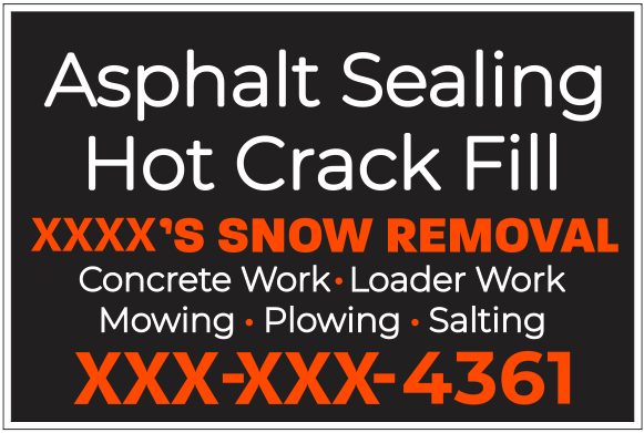
x1.png

He approves it and then 3 hours later texts "Don't order those signs!!"
His wife's brother designs billboards and makes six figures in Noo Yoak City, and he threw a fit AT EASTER when he found out that my customer wasn't having him design his signs. Like his sister and his father-in-law were even pissed at him. Not even to charge him mind you, purely for his ego. The dude was especially pissed because I had modified (deconstructed really) the logo he had designed for my customer.
The next day my customer says "Just use this and go ahead with the order".
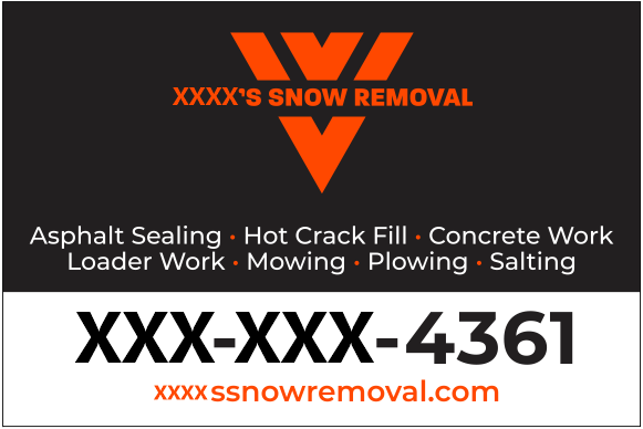
xRodrigo.png
 

Gino

Premium Subscriber
Not me. At the size being made, nothing but the phone number looks like it'll be more than an inch tall, if that. Ya won't know who or what you're calling. All that wasted space on the upper half is ridiculous. The guy doesn't know or understand balance. He's used to everything becoming 1,000% larger. He's no sign designer, that's for sure. As for the OP's version, just don't go out to all four edges of the face and use a different, more substantial type style for the main header.
 

Gettin'By

New Member
Bottom one looks more like a fridge magnet than a sign to me. Logo's the biggest thing on it like I'm already familiar with the company and just need to scan the fridge and find the contact info. But the what you do and why I might want to contact you in the first place is just about the smallest thing on it and no one will read it walking or driving by. For this purpose, I prefer the OP's version on top.
 

Boudica

I'm here for Educational Purposes
I read "poly bag" and thought this was more of a packaging thing than a sign... then I googled poly bag and it's just a yard sign?
I still say a prominent logo and phone number are really the most important to be noticeable at a glance. And for this type of business I think that's what it needed. What do I know though. Maybe Hot Crack Fill should be the biggest thing on the sign. I just think the first version is busy looking and I notice nothing at a glance.
 
Last edited:

Boudica

I'm here for Educational Purposes
I think the thing I like best about brother in-law's version is how the contact info is isolated in the white. It really stands out and it's the first thing I see.
 

weyandsign

New Member
The in-law's design is good for a business card. 1/2" tall letters aren't readable on a yard sign, unless they are bolder and spaced out more. Even then it's going to be hard for a passer-by to read it. But I would do what the customer wants, just mention that it may be hard to read and let them decide.
 
Top