MatrixSigns
New Member
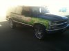
Offsite pics replaced. Please observe our rules on photo posting.
Attachments


Last edited by a moderator:
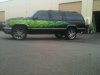
looks like you did the prints / wrap, then added the text lines afterwards, separately? If that's the case, why wouldn't you have printed the text along with the graphics?
I'm no expert on wraps, by any means!... so I'm wondering if that is the normal way of things? ( I didn't think so)
