-
I want to thank all the members that have upgraded your accounts. I truly appreciate your support of the site monetarily. Supporting the site keeps this site up and running as a lot of work daily goes on behind the scenes. Click to Support Signs101 ...
You are using an out of date browser. It may not display this or other websites correctly.
You should upgrade or use an alternative browser.
You should upgrade or use an alternative browser.
My logo... thoughts?
- Thread starter LEGEND
- Start date


Good first go.
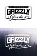
Lose the bread crumbs up top and change the typeface of "Graphics" to work better with "Grizzly". It's a readability issue. Give it the squint test- recognizable at a distance and at the smallest of sizes.
Try to work the claw marks in to the typography somehow or make it more prominent so as not to kill the title.
Fred Weiss
Merchant Member
I think you need to pick a different font for the top line unless you sell BANNEAS, GAAPHICS and WAAPS. The "A" and "R" look identical.
Last edited:
LEGEND
New Member
I think you need to pick a different font for the top line unless you sell BANNARS, GAAPHICS and WAAPS. The "A" and "R" look identical.
I saw that too :ROFLMAO: thanks
Marlene
New Member
with a different font for the services as suggested the larger services version seems to work better. for the name I too suggest another font or just get rid of the outlines as they clutter it up and add nothing. the claw marks are a pretty good idea but you have a three toed bear so it doesn't look right. I wouldn't make it stand out more as if you get rid of those outlines it would look better done as you have it
AlphaArtCompany
New Member
Just lose the outlines. I was outline crazy when I first started. I look at some stuff I did years ago and just wonder, what was I thinking. It has to be legible from a distance or it's completely ineffective. I like the claw marks though
BIG EASY DOES IT
New Member
.I think you need to pick a different font for the top line unless you sell BANNARS, GAAPHICS and WAAPS. The "A" and "R" look identical.
I saw this immediately. I thought he put spelling errors in his designs and then posted them. Maybe you could tuck in the R a little more to look less like the A.
Would be cool to see the claw marks through the rest of the design. Alot more playing around for that though.
Jillbeans
New Member
The basic idea is OK, the only thing I really like about it is the claw mark 
The fonts are difficult to read and will look dated rather quickly.
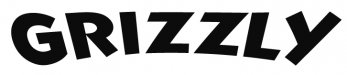
I'd go for a western style Playbill based font for Grizzly, and distress it a bit.
Try to avoid outlines as much as possible.
The laundry list could be in a nice clean taller font such as Kenyan Coffee.
The Graphics part could be any script, but not that one.
You need something ballsier.
Design it first in black and white, tinker with it until it's perfect, then add your colors.
Love....Jill
The fonts are difficult to read and will look dated rather quickly.
I'd go for a western style Playbill based font for Grizzly, and distress it a bit.
Try to avoid outlines as much as possible.
The laundry list could be in a nice clean taller font such as Kenyan Coffee.
The Graphics part could be any script, but not that one.
You need something ballsier.
Design it first in black and white, tinker with it until it's perfect, then add your colors.
Love....Jill
Fred Weiss
Merchant Member
I think you need to pick a different font for the top line unless you sell BANNEAS, GAAPHICS and WAAPS. The "A" and "R" look identical.
Lol I read banners as banana-ers, man that's Waaped!
Stormyj
Just another guy
I think you need to pick a different font for the top line unless you sell BANNEAS, GAAPHICS and WAAPS. The "A" and "R" look identical.
That waskily wabit.


LEGEND
New Member
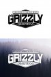
What about something like this (rough sketch)
I think putting "Graphics" in the tagline is redundant.
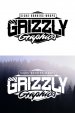
Dig it, I implemented some of your advice into this one...
Attachments
I think Jill makes a great point about the redundancy in having the word graphics twice.
I really like #1 of the latest iterations.
One little thing I'd love to at least see you try is to drag the claw marks all the down through the G R and most of the I. This is a frickin' badass, bold company with some moxie. Those little puny marks you've barely dented the G with are like what a hamster would make.
You've got a word in grizzly that very few other words resemble. In my eyes as a designer that tells me that I can push the envelope a little on an effect like you're trying and the vast majority of viewers will still know what it reads.