SSG_SIGNS
New Member
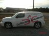
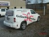
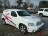
This was a fun vehicle, it looks classy and it's easy on the eyes. The pink was printed on 180cv3 & die cut, then the black is just die cut vinyl.
Don't think he was looking for your critique, he was proud of his work and it looks good to me. "Instant Karma gonna get you.."Tell us more did you design this ?
The side fits, but still think it could improve.
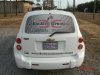
The back window ..FAIL
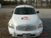
The hood could have been better, it looks blah
Was the budget the cause if so well it ok then
if customer gets results even better next time use this as a before and lets see a great after in 3-5 years