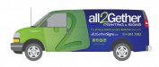
"Google results show crap" Yea I agree with that. My point was that all the crap you see when searching google is better than OP's layout. <--Nope. Maybe when I said OP should use images of exploding sharks I might have been exaggerating a bit. <--Yep. Vibrant imagery doesn't have to be loud or obnoxious, it can be done in a sleek meaningful way. Also I would argue that you can wrap the van in dog crap and it would still be relevant to the service. <--See google definition of "relevant" The van is a giant moving billboard that says to the viewer "hey you, you see this awesome design? this is something your company could benefit from having". And yea simple is better in most cases but this isn't a letterhead or a business card, <--These are not examples of advertising. it's an ad that has less than 3 seconds to rope in the viewer and make them want more. Currently the van is blue and green, the color of trees and the sky. <--Blue:See also; water, blueberries, jeans, eyes, asphyxiation. There is not 1 element on it that makes me even give a darn what it is you do.
OK anyway since you are likely to stay with what you have just think to yourself, from a visual heirachy what element is going to draw me and and read about what it is you do in a matter of seconds. I just don't see that here.