-
I want to thank all the members that have upgraded your accounts. I truly appreciate your support of the site monetarily. Supporting the site keeps this site up and running as a lot of work daily goes on behind the scenes. Click to Support Signs101 ...
You are using an out of date browser. It may not display this or other websites correctly.
You should upgrade or use an alternative browser.
You should upgrade or use an alternative browser.
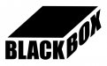
Need critique on logo
- Thread starter SignManiac
- Start date

artist4christ
New Member
If it is just going to be text like that then I would work on the kerning for "BLACK" and then kern "BOX" to fit your boxsih justified text.
Can you work in any sort of an icon at all?
Can you work in any sort of an icon at all?
SignManiac
New Member
Not sure what you mean by icon? What would you adjust for the kerning?
artist4christ
New Member
I would adjust the kerning for the L and A & A and C.
Gino
Premium Subscriber
I looks to me as though you've read Mike Steven's book and have mastered B&W applications. You only need to have your client change their name to 'White Box' so their copy color matches their name as in your sample.
A better approach might be.....
However, after you've added in some colors, this might work much better.
Please advise your client that you know what he wants and how much it will cost and charge him about $32.78. In this way, you're sure to get the action from all of his friends.

Keep up the good work. You're a winner !!
.
A better approach might be.....
However, after you've added in some colors, this might work much better.
Please advise your client that you know what he wants and how much it will cost and charge him about $32.78. In this way, you're sure to get the action from all of his friends.
Keep up the good work. You're a winner !!
.
GoodPeopleFlags
New Member


TheSellOut
New Member

SignManiac
New Member


SignManiac
New Member
") Which we now have a motor for and working controls. The ailerons are slick now! I'm giddy with excitement for the first flight.
Which we now have a motor for and working controls. The ailerons are slick now! I'm giddy with excitement for the first flight.
SignManiac
New Member
Yes, very simple concept. You would be surprised at what people will buy. I'm even thinking of manufacturing a line of white boxes as Gino suggested.