• I want to thank all the members that have upgraded your accounts. I truly appreciate your support of the site monetarily. Supporting the site keeps this site up and running as a lot of work daily goes on behind the scenes. Click to Support Signs101 ...

Need design brainstorming help, please.

Pat Whatley

New Member
I was contacted about this project because I know a guy who knows the guy. They need a logo design they can use for fundraising purposes and I told them I could see what I could do.....and I'm just not getting there. I've tossed it around mentally for a week now, sketched stuff on the dry erase countless times and what you see here is about the best I've come up with. After seeing the devastation that the tornadoes left in Alabama after the storm and realizing the effect it has on a kid when their whole world was destroyed I kind of want to do this and do it successfully so I'm asking for some input.

ABOUT THE FOUNDATION:
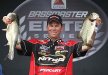
It's called TACKLE THE STORM . The idea is to go into areas that have been devastated by storms and offer what help they can, including providing fishing equipment for kids who have lost everything. They've got several professional BASS anglers and fishing equipment companies on board. I've seen the look on the faces of kids who have lost their homes, or their families, or just been kicked in the sack by life completely change when somebody just takes them fishing for a few hours. I know, sounds corny, but there's just something about it that lets them completely forget their troubles for a little while.

WHAT THEY WANT TO DO WITH THE LOGO
Think branding. I'm thinking it needs a strong icon that can stand alone and also a version including the typography of the name.

WHAT'S IN IT FOR YOU
Well....not a thing unless you believe in karma.

I'm not asking for anybody to spend their time working out designs for me. I'd rather tap into the brains of the collective and just get as many ideas as possible. During my brief ad agency days we spent time almost every morning brainstorming ideas for various projects, just tossing out ideas, letting the ideas feed off of each other until a brilliant direction worked itself out of the pack. I don't have an agency full of designers to brainstorm with....I've got you people.

Anybody get any creative ideas from the name or the concept? Please, if you do toss it out there for me.....and thank you for the help.


RobbyMac

New Member
I feel your pain. I did a few bass fisherman and bass fishing related company logos (before I was even into fishing) and they were always tough. Not sure I'd have better ideas now.

Perhaps incorporate tacklebox and toolbox in some way (And not use the common fish or hook).

I keep thinking 'how do you show repair & rebuild?', rather than focusing on the storm (tornado). Rays of sun after the storm type thing, so it goes along with the uplifting nature of the biz rather than the destructive aspect.

I do have a few bass vectors which were never used though, and I'll keep thinking on it.

what about a simple silhouette of father and sun fishing off a dock? sun in background and the text. It doesn't scream devistation, but it conveys the simple pleasantries of fishing. google image search "silhouette fishing" to see what i mean.
 
If you have some of the pros involved, how about making a drawing with an angler posing like they do at weigh-ins? Put a fish in one hand and a tornado in the other. Put the name of the organization and any other sponsors on the angler's jersey.
 

Attachments

  • Kevin-VanDam.jpg
    Kevin-VanDam.jpg
    53.3 KB · Views: 111

ForgeInc

New Member
The fishing rod tornado is solid idea. Real solid. Incorporate some "friendly" type and that could be a good one.

What about a play on typography?? You could have a somewhat scripty, hand drawn fishing line kind of look to the word "tackle the" (like the line is forming the letters) and them storm could be a more aggressive typeface and the line could then wrap around it, almost "mummy" like?.

Or what about something kinda similar to the "biggest loser" concept? Where the line kinda wraps around some clean type that is drawn in the shape of a storm?

Once you get a few more basic concepts kinda sketched out, then of course you can start mixing and matching parts and pieces maybe...

Not sure I would incorporate a bass into it. Something with that shape might work, but it might too literal? i dunno...just thinkin out loud...
 

ForgeInc

New Member
Also...consider your audience. The overall look should feel fun and youthful, not too aggressive or plain. have fun with it!
 

qmr55

New Member
I think your ideas are great so far, take them and run with it! Try and give it a playful touch but still getting the idea across. Maybe try a fun font? Here off of your ideas...

Just an idea, run with it!
 

Attachments

  • tackle_the_storm.jpg
    tackle_the_storm.jpg
    52.2 KB · Views: 97

Jillbeans

New Member
I sort of like the one with the fish being pulled out of the cyclone.
Could you modify that simplistically to make a fish head (oh no now I'll be singing that song all day) blending into a tornado body?

I like the fishing rod thing too.
Could also do something with a net?
Love....Jill
 

Attachments

  • fish.jpg
    fish.jpg
    74.6 KB · Views: 81

SignManiac

New Member
Pat, here's a rough concept for you to play with if you like. Maybe get John Deaton involved to give it his special touch? You're welcome to run with this if you like. This is all basic clip art elements rearranged but they can be redrawn to make it more original. This is by no means refined. Colors can be completely different. Lots of possibilities.
 

Attachments

  • tackle.jpg
    tackle.jpg
    71.6 KB · Views: 88

Tim

New Member
The fish in the tornado works well. I like it alot. How about turning his head facing out, and having him wink, while throwing the hook. To me that would represent fighting back against the storm...or not giving up. Something of that sort. Just more food for thought!
All the Best!
 

thinksigns

SnowFlake
needs a large dose of finesse, but what came to mind for me.
 

Attachments

  • Screen shot 2011-12-09 at 8.43.41 AM.png
    Screen shot 2011-12-09 at 8.43.41 AM.png
    38.4 KB · Views: 92

mikefine

New Member
I think the fishing equipment theme should be primary, in order to get more corporate contributors. The logo has to mean something for them -- the sponsors. Also, the storm shouldn't be primary because you want it to be positive, not negative. Maybe a tackle box character, with the top opening up and biting the tornado storm. Or a kid holding a fishing pole and tackle box which is eating the storm.
 

bob

It's better to have two hands than one glove.
Regardless of whatever they use for a logo, the concept of this organization truly is bizarre.

"Here little Johnny, the big nasty storm has carried off your home, your family, and perhaps your goat, so take this fishing pole and it will all be better."

Bizarre...
 

Pat Whatley

New Member
Never. F**king. Mind.

Damn I'm pissed off about this. It appears that they group broadcast the need for a new logo to the world. Apparently somebody sent them information about what to look for in a new logo and what it would need to accomplish.....then they went with the first one they got that some fisherman's wife slopped together.

The part that pisses me off is that apparently I give more of a s**t about this image their trying to build than they do. First time in years I've made a decision to break my "don't give away your craft" rule and it bites me in the ***. Makes me want to go find some kid fishing and break his rod.

I apologize for dragging y'all into this. We're just not capable of competing with this...
 

Attachments

  • tackle.jpg
    tackle.jpg
    25.6 KB · Views: 85
Last edited by a moderator:

HulkSmash

New Member
Never. F**king. Mind.

Damn I'm pissed off about this. It appears that they group broadcast the need for a new logo to the world. Apparently somebody sent them information about what to look for in a new logo and what it would need to accomplish.....then they went with the first one they got that some fisherman's wife slopped together.

The part that pisses me off is that apparently I give more of a s**t about this image their trying to build than they do. First time in years I've made a decision to break my "don't give away your craft" rule and it bites me in the ***. Makes me want to go find some kid fishing and break his rod.

I apologize for dragging y'all into this. We're just not capable of competing with this...

That. is. Awful.
 

Pat Whatley

New Member
Oh, I'm sorry.....a fisherman's wife with "a team of graphic designers" did it. Well damn, now that I know "a team of graphic designers" was involved I might have to rethink my position.
 
Top