• I want to thank all the members that have upgraded your accounts. I truly appreciate your support of the site monetarily. Supporting the site keeps this site up and running as a lot of work daily goes on behind the scenes. Click to Support Signs101 ...

Need ideas for trailer design

Stacey K

I like making signs
Hi all! I've been doing the graphics for this company for years. This is a new division and they created the logo. They said I should use some "creativity" and I'm a bit stuck. They would go for a full wrap if they like it.

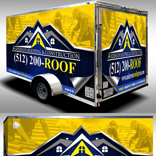
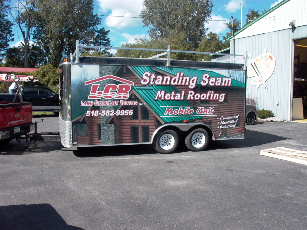
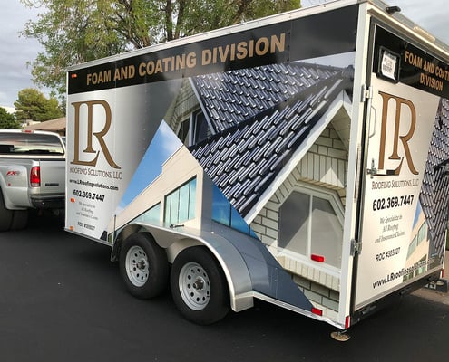
All the vehicles are black with white vinyl. This is my initial idea simply based on the past trailers and trucks we did. Yes, I know the logo needs adjusting, again, starting with a rough idea. I added a few from others that I kind of like. Anyone have any input? I do the like yellow and blue trailer maybe I could do something similar since the logos are similar in shape?

1741098888757.png
1741099026313.png
1741099097399.png
attachment_125280392
JOB-SITE-TRAILER-WRAPS-AND-VINYL-GRAPHICS.jpg
w=495,h=400,fit=crop
 

JBurton

Signtologist
I like the black and white honestly, and it'll look great for years on end vs needing to be pulled and rewrapped in 5. The green/black one just doesn't do it for me, not sure if it's crooked, or if the building just isn't doing it for me.
The other examples look nice, but the only legible info I see is the blue and yellow one having the phone number so prominent. Everything else requires a moment to find that much, and 'standing seam metal roofing' is twice as big as the logo, and a fairly vague google search that could just as easily point a customer to the competition, based on who has the best SEO.
Idea: stack Wisconsin and Roofing to better utilize vertical space on the side of the trailer, swap the phone number to gotham, eliminate a few trees.
 

Stacey K

I like making signs
I like the black and white honestly, and it'll look great for years on end vs needing to be pulled and rewrapped in 5. The green/black one just doesn't do it for me, not sure if it's crooked, or if the building just isn't doing it for me.
The other examples look nice, but the only legible info I see is the blue and yellow one having the phone number so prominent. Everything else requires a moment to find that much, and 'standing seam metal roofing' is twice as big as the logo, and a fairly vague google search that could just as easily point a customer to the competition, based on who has the best SEO.
Idea: stack Wisconsin and Roofing to better utilize vertical space on the side of the trailer, swap the phone number to gotham, eliminate a few trees.
I'd be happy to ditch some of the trees...it's been a welding and cutting nightmare for years LOL Flexi always stops responding.
 

kcollinsdesign

Old member
I know the feeling. Every so often the well is just dry. Without being preachy, here are some rules I follow:

•Don't be so literal. the important thing is to create something memorable. You don't have to have the whole business plan explained in a few marks.

•If you are going to use imagery, think about what the product or service does, not what it is.

•Little guys are popular, but they need to be inclusive. Animals are less risky. (Maybe a turtle with hat and a roofing hammer)

•Keep it simple. Panelize your copy to organize your message.

•Make sure it works in Black and White before you add color.

•Turn off your computer and start with a pencil and a piece of paper.

•Don't copy Dan. (note: Dan is a great guy and his company is at the top of the game)

Most of you know this stuff already, but it is good to be reminded!
 
Last edited:

Manuel Upton

New Member
I might be biased but I like the LCR trailer. We did that back in 2010. They are probably the largest roofing company in our area, and they really just wanted to push the Standing Seam at the time.
 

ddarlak

Go Bills!
i like the clean look of the white on black, not crazy about the random placement and fugly font "count on us!"

i know roofers are generally untrustworthy but the count on us statement doesn't really instill confidence.
 

DarkerKat

design & such
Inclined to agree with others than the cleaner looks are better, but if they are set on a full wrap rather than cut vinyl maybe try to incorporate one of the colors from their logo and knock the trees into the background a bit so there is more focus on the roof itself?
(pls forgive the very bad live traces)
1741189898224.png
 

Stacey K

I like making signs
Thank you everyone for your help! I just sent a few generic mock-ups to give them a couple ideas and see what direction they might want to go in...I like #1 and #3 best. I don't want to get too crazy just yet until they have a little time to think things over.

One thing I've learned is sometimes people have big ideas until they see ideas on paper. Then they realize what they had is easy to read and recognize.

Jburton, not sure if that's what you meant...but I like it better than the original.

DarkerKat - I like the subtle difference in tree color...nice idea

1741195334358.png
1741195429281.png
 

JBurton

Signtologist
I really dig the off color trees, I'd nearly jack darkerkat's art outright. I'd bet the customer would love the differentiation between the commercial and residential.

I like the blue! Only 'issue', I say as I've never run into it, lots of folks complain about panel inconsistency on their latex, particularly with blues. I also like the workers in the background one, but I think that would look better as a mural or something.

not crazy about the random placement and fugly font "count on us!"
Agreed, and worse, it's "count on Us!" Who capitalizes Us? You could kinda make it work, get an average number of shingles and nails in a new roof, or nails and shingles installed to date. 3 lines:
1,543,420 Shingles
6,173,680 Nails
250 Employees
Count on us!
But that's just confusing, and trying to make a slogan fit a given situation, it feels forced.

they really just wanted to push the Standing Seam at the time.
Hey, you don't have to justify it with me, bad designs are between the customer and their god, we just design and print what we're given.
But really, that's pretty wild Stacey managed to pull a trailer someone else on here did.
 

Stacey K

I like making signs
Update! My customers don't waste time. They said DEFINATELY this one! (with a few small changes)

I'll suggest the lowercase U- I can't remember if I ever said anything about that or not. They want LLC smaller so that will give me some room to make the building smaller and the name larger.

I feel kinda bad now everyone put so much thought into this and nothing came of it. But I did say above...."One thing I've learned is sometimes people have big ideas until they see ideas on paper. Then they realize what they had is easy to read and recognize."

At any rate, it got us all thinking, thank you everyone!!!

1741203021602.png
 

JBurton

Signtologist
I feel kinda bad now everyone put so much thought into this and nothing came of it
Eh, if everyone here was so worried with investing time into 'nothing', they wouldn't be piddling around on here. I just like to see how other folks run through their processes, hear their anecdotes about the worst customers, and see what kind of regional differences make as far as artwork.
In this case, I'm glad he went with black on white, makes for an easy install, and the trailer won't get blazing hot in the summer.
 

kcollinsdesign

Old member
Well, I'm glad it got resolved.

The design is not even adequate. The floors of the building do not line up, the perspective is off, the trees look like the aftermath of a forest fire, nobody cares if the company is organized as an "LLC" (why advertise that?), and a phone number that nobody will write down or remember occupies the prime space. The only bright spot was the "Count on Us!" tag line which made me laugh out loud!
 
Top